Большинство презентаций терпят неудачу сначала из-за визуальных недостатков, а затем уже из-за других проблем. Слайды слишком перегружены информацией, диаграммы нечитаемы с третьего ряда, а стоковые фотографии никак не связаны с излагаемой мыслью. Аудитория перестаёт доверять презентации ещё до того, как докладчик скажет что-либо, заслуживающее доверия.
Самое обидное, что все это несложно исправить. Для создания качественных визуальных презентаций не требуется дизайнерское образование или дорогостоящее программное обеспечение. Необходимо последовательно применять четкий принцип: каждый визуальный элемент должен оправдывать свое место, делая сообщение более понятным, а не заполняя пространство или демонстрируя приложенные усилия.
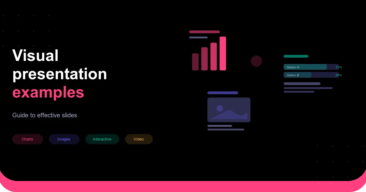
В этом руководстве рассматриваются эффективные визуальные форматы, методы, отличающие хорошие визуальные презентации от невзрачных, а также принципы дизайна, которые объединяют все элементы воедино.
Что делает визуальную презентацию эффективной?
Разница между полезным и вредным визуальным представлением обычно сводится к намерению. Диаграмма, которая выделяет одну единственную важную мысль и делает её очевидной, выполняет свою задачу. Диаграмма, перегруженная двенадцатью рядами данных без пояснений, — это просто шум с легендой.
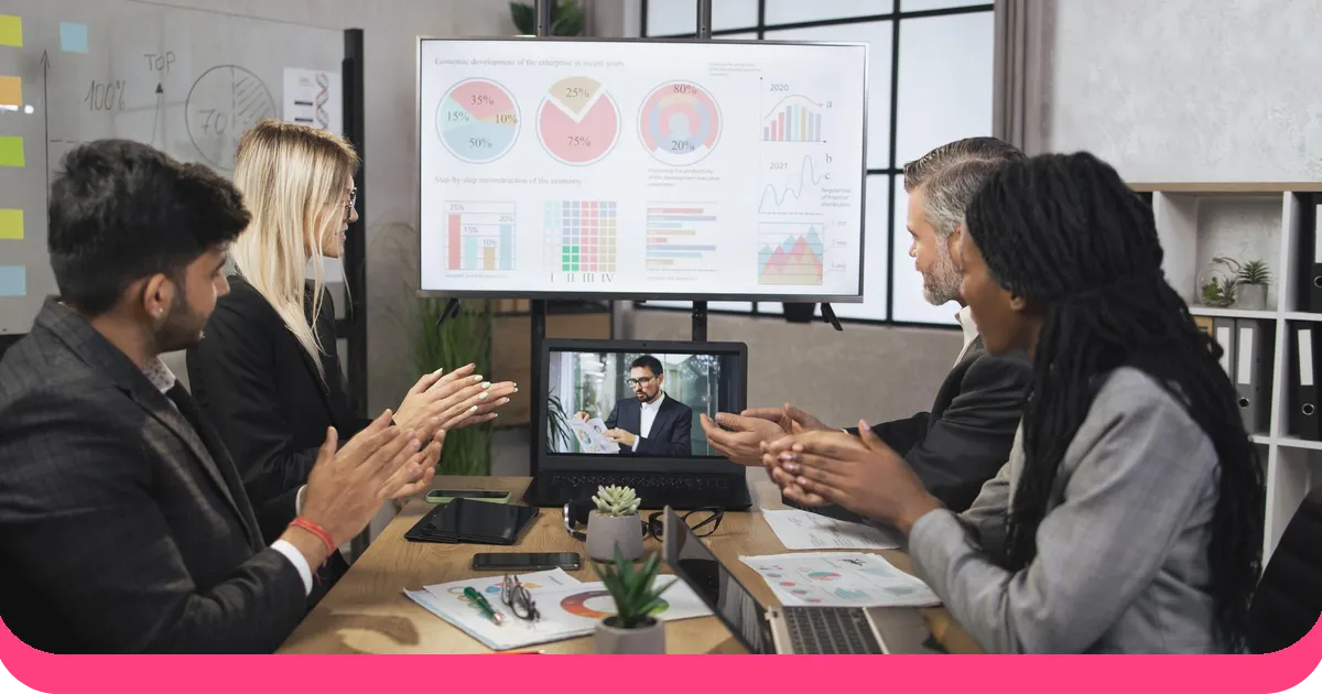
То же самое относится ко всем остальным визуальным форматам. Фотография, которая помещает вашу аудиторию в контекст, который вы описываете, заслуживает своего слайда. Стандартное фото разношерстной команды, указывающей на доску, не принесет ничего. Тридцатисекундный видеоролик от клиента, демонстрирующий искренние эмоции, воспринимается иначе, чем краткий тезис «клиенты нас любят».
Стандартом является продуманный дизайн. Не красивый дизайн, не сложный дизайн. Дизайн, который служит смыслу сообщения и уважает внимание аудитории. Все остальное вытекает из этого.
Виды эффективных наглядных пособий
Для разного контента требуются разные визуальные форматы. Знание того, какой из них использовать и почему, составляет большую часть практической работы.
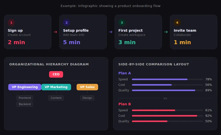
Инфографика и диаграммы
Инфографика наиболее полезна, когда ваш контент имеет структуру, которую скрывает проза: многоэтапный процесс, сравнение вариантов, иерархия, временная шкала или набор данных с интересной закономерностью. Лучшие инфографики используют иконки, цвет и минимум текста, чтобы сделать эту структуру видимой с первого взгляда. Самая распространенная ошибка — попытка уместить все в одну графику. Инфографика, требующая внимательного чтения, уже потерпела неудачу. Если вашей аудитории нужно ее изучать, упростите ее.
Диаграммы и графики
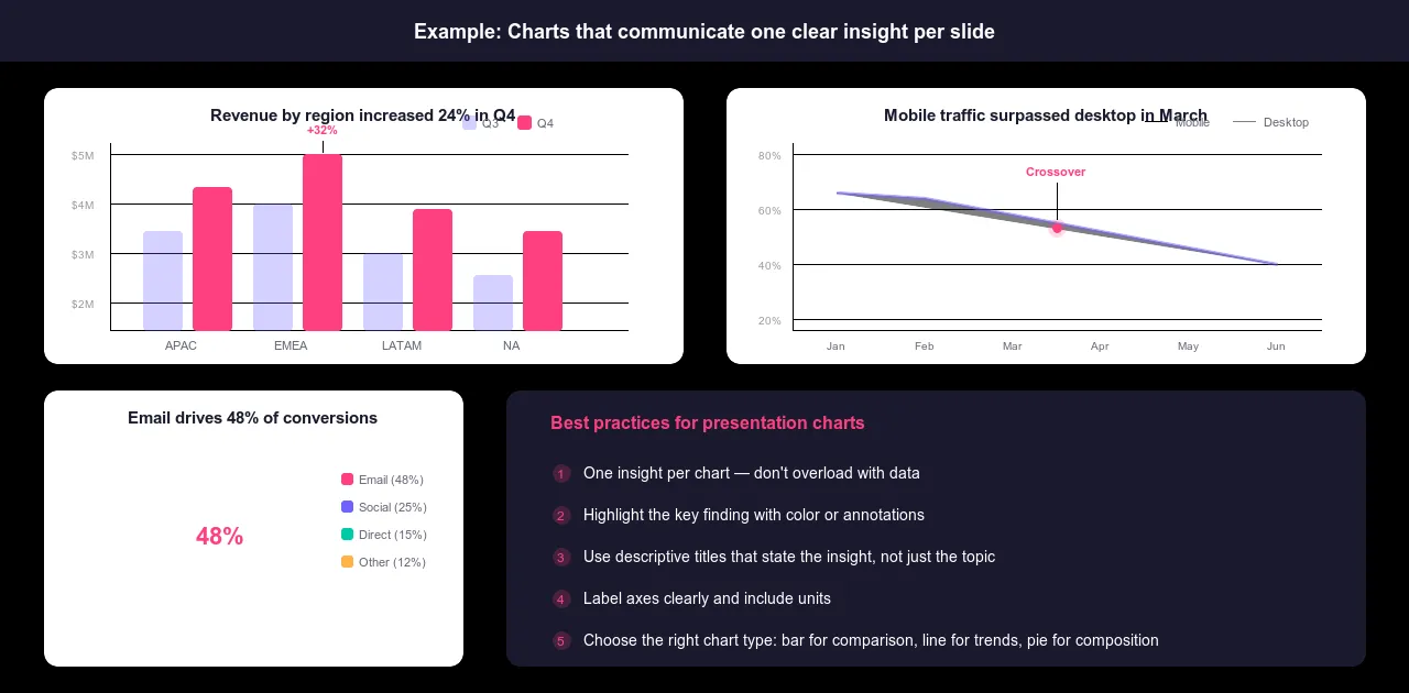
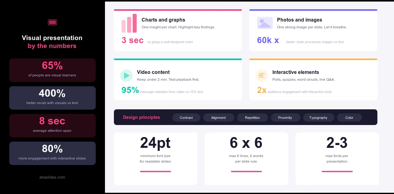
Диаграмма, на анализ которой у вас ушли часы, должна передавать свою мысль за секунды. Это происходит только тогда, когда тип диаграммы соответствует сути вопроса. Столбчатые диаграммы подходят для сравнения значений по категориям. Линейные диаграммы — для отображения изменений во времени. Круговые диаграммы используются редко и только тогда, когда показывают части целого с пятью или менее сегментами. Диаграммы рассеяния — для отображения взаимосвязей между двумя переменными. Таблицы используются, когда точные числа важнее визуальных закономерностей.
Самая распространенная ошибка — это использование столбчатой диаграммы независимо от того, что вы показываете, и размещение слишком большого количества рядов данных в одной визуализации. Один вывод на диаграмму. Подписывайте оси. Указывайте единицы измерения. Используйте цвет или аннотации, чтобы привлечь внимание к важному результату. Диаграмма без контекста — это просто шум с легендой.
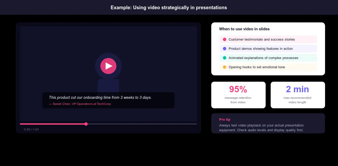
Видео-контент
Видео заслуживает своего места, когда демонстрация значительно убедительнее описания. Отзывы клиентов, которые потеряли бы свою силу в виде письменных цитат. Демонстрации продукта, где реальные вещи убедительнее скриншотов. Интервью с экспертами, которые добавляют достоверности, которую невозможно обеспечить иным способом. Эмоциональный контекст, который статичные изображения не могут передать.
Продолжительность видеороликов не должна превышать двух минут. Если видео будет длиннее, вы заставите аудиторию переключиться с просмотра презентации на просмотр видео, что нарушит ритм выступления. Перед началом презентации проверьте воспроизведение на вашем оборудовании. Видео, которое не воспроизводится или отображается в плохом качестве, быстрее всего сорвет презентацию.
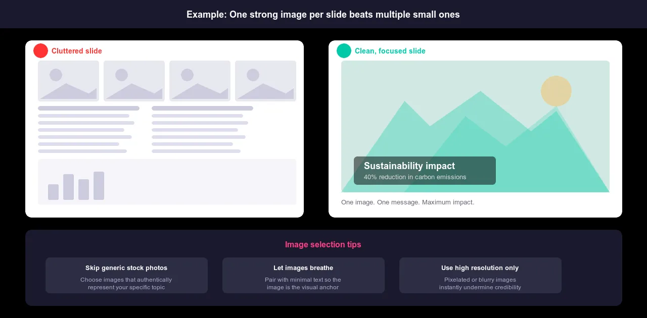
Фотографии и изображения
Одно яркое изображение на слайде в сочетании с минимальным текстом работает эффективнее, чем слайд, перегруженный мелкими визуальными элементами. Пусть изображения занимают пространство, а не делят его. Изображение должно быть визуальным якорем, а не украшением рядом с основным содержанием.
Неправильно подобранное изображение активно подрывает ваше сообщение. Шаблонные стоковые фотографии сигнализируют о том, что вы не продумали до конца, что должна увидеть ваша аудитория. Если вы выступаете перед технической аудиторией, рассказывая об инновациях, фотография людей в деловых костюмах, обменивающихся рукопожатиями в конференц-зале, будет работать против вас. Выбирайте изображения, которые достоверно отражают вашу тему. Оригинальные фотографии, если они доступны, почти всегда лучше, чем стоковые.
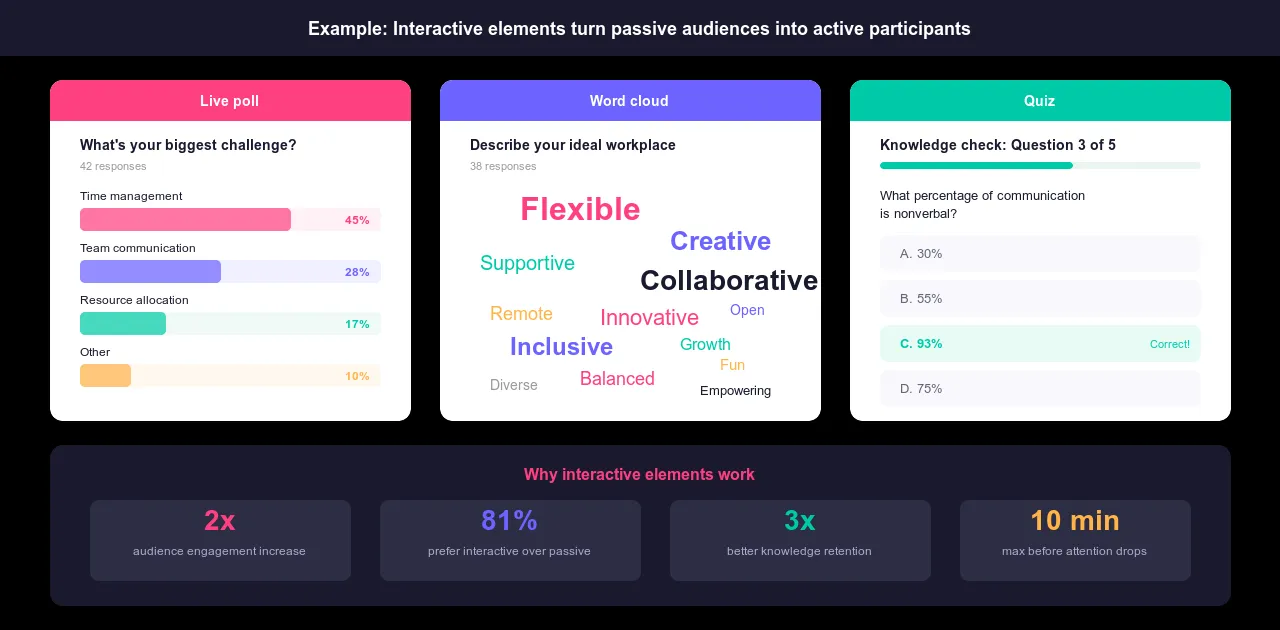
Интерактивные элементы
Статические горки движутся только в одном направлении. Интерактивное Эти элементы меняют ситуацию: они дают вашей аудитории что-то, на что можно отреагировать, что смещает динамику от пассивного слушания к активному участию.
Опросы в режиме реального времени позволяют выявить, во что уже верит ваша аудитория, прежде чем вы попытаетесь изменить её мнение. Облака слов показывают, что находит отклик в реальном времени. Анонимные вопросы и ответы позволяют зафиксировать то, что действительно интересует людей, а не то, что они готовы спросить вслух. Викторины проверяют понимание в середине презентации, позволяя замедлить темп там, где это необходимо, вместо того, чтобы обнаружить путаницу в конце. AhaSlides создан именно для этого.
Пять эффективных приемов создания визуальных презентаций
Знание визуальных форматов — это основа. Именно эти приемы отличают презентации, в которых визуальные элементы используются грамотно, от тех, в которых они используются хорошо.
1. Сосредоточьтесь на потребностях вашей аудитории.
Одна и та же тема требует совершенно разных визуальных подходов для разной аудитории. Презентация на тему: аналитика данных Тема, интересующая исследователей, совершенно не похожа на ту, что интересна начинающим предпринимателям. Содержание может частично совпадать, но визуальное оформление — нет.
Прежде чем создавать первый слайд, задайте себе три вопроса. Что именно должна понять эта конкретная аудитория? Какой уровень детализации будет для них полезен, а не перегружен? Какие визуальные элементы они сочтут убедительными, а не запутанными?
Специалисту по анализу данных нужны подробные диаграммы и точная методология. Руководителю — наглядное представление, демонстрирующее влияние на бизнес. Новому владельцу бизнеса нужно что-то доступное, что связывает концепцию с его конкретной ситуацией. Диаграмма, которая впечатляет одну аудиторию, может оттолкнуть другую. Разрабатывайте дизайн, ориентируясь на присутствующих, а не на ту версию информации, которая существует только в вашей голове.
2. Целенаправленно используйте анимацию и переходы.
Анимация имеет плохую репутацию, потому что большая её часть её заслуживает. Текст, появляющийся сбоку, слайды, которые вращаются, подпрыгивающие маркированные списки: всё это добавляет движение, не добавляя смысла, и сигнализирует вашей аудитории о том, что вы потратили время не на то, на что нужно.
Целенаправленная анимация отличается. Она контролирует, что и когда видит ваша аудитория. Показывайте элементы диаграммы по одному, по мере того как вы проводите анализ, чтобы аудитория сосредоточилась на каждом пункте, прежде чем появится полная картина. Создавайте диаграмму процесса шаг за шагом, а не показывайте все этапы одновременно. Направляйте внимание на определенную часть сложного визуального представления, прежде чем расширять его. Сигнализируйте о переходе между основными разделами таким образом, чтобы это ощущалось как продуманный, а не резкий переход.
Критерий прост: если удаление анимации ничего не изменит, удалите её. Любая анимация должна делать контент более понятным или темп повествования более продуманным. Ничто другое не оправдывает её удаление.
3. Пишите содержательные заголовки слайдов.
Лучшее заголовки слайдов Заголовки слайдов либо расплывчаты, либо вовсе отсутствуют. «Обзор», «Анализ», «Результаты 3 квартала» ничего не говорят аудитории о том, что она собирается увидеть. Заголовок слайда должен быть достаточно конкретным, чтобы человек мог понять суть слайда, исходя только из названия.
Вместо «Данные» используйте «Мобильный трафик увеличился на 35% по сравнению с прошлым годом». Вместо «Процесс» используйте «Три шага к внедрению». Вместо «Результаты» используйте «Удовлетворенность клиентов снизилась во всех регионах, кроме Северо-Востока». Суть идеи содержится в заголовке. Слайд это подтверждает.
Заголовки также служат для навигации. Когда ваша аудитория на мгновение теряет нить повествования, конкретный заголовок помогает ей сориентироваться, не заставляя вас повторять сказанное. Сделайте заголовки визуально четкими по сравнению с основным текстом: крупнее, жирнее и отформатированными так, чтобы они первыми бросались в глаза.
4. Используйте реквизит и креативные наглядные пособия.
Слайды — это стандартный вариант. Но это не всегда лучший инструмент. Физический продукт, который можно подержать в руках и с которым можно взаимодействовать, создает осязаемость, которую не может воспроизвести ни один скриншот. Предмет, который делает абстрактную концепцию конкретной, дает вашей аудитории что-то, за что можно зацепиться. Необычный визуальный формат, изометрическая иллюстрация, нарисованная от руки диаграмма, вертикальное расположение — все это говорит о том, что это не стандартная корпоративная презентация, собранная накануне вечером.
Реквизит и креативные визуальные элементы работают, когда они уместны, а не просто привлекают внимание. Демонстрация продукта, где вы держите в руках реальный предмет, убедительнее, чем пять слайдов с его описанием. Личные фотографии, иллюстрирующие личную историю, имеют больший вес, чем стоковые изображения, иллюстрирующие ту же историю. Креативный выбор должен служить сообщению, а не заменять его.
5. Проведите репетицию с использованием визуальных материалов и соберите отзывы.
Презентация, которая хорошо выглядит на вашем ноутбуке, может плохо выглядеть в зале. Проверьте всё на реальном оборудовании, которое вы будете использовать, прежде чем выступать. Воспроизводится ли видео без задержек? Чётко ли читается текст с задних рядов? Правильно ли подобраны цвета при освещении в зале? На эти вопросы нужно ответить во время репетиции, а не в середине презентации.
Представляйте материал тестовой аудитории перед реальной. Задавайте конкретные вопросы, а не просто спрашивайте: «Что вы думаете?». Были ли диаграммы понятны? Не было ли что-то непонятным или отвлекающим? Добавили ли видеоролики что-то новое или отнимали время без необходимости? Расплывчатые отзывы приводят к расплывчатым улучшениям. Спросите о конкретном, что не работало, и вы получите то, что действительно можно исправить.
Удалите визуальные элементы, которые не способствуют передаче вашего сообщения. Замените нечеткие диаграммы на более понятные. Удалите видеоролики, которые не производят должного впечатления. Каждый визуальный элемент, который останется, должен быть там, потому что он делает вашу презентацию более убедительной, а не потому, что вы потратили время на его создание.
Принципы дизайна для визуального воздействия
Хороший визуальный дизайн — это не просто украшение. Это система, которая делает ваш контент читаемым, удобным для навигации и связным от первого до последнего слайда. Эти шесть принципов применимы к любой визуальной презентации независимо от формата, темы или аудитории.
контраст Это способ установить иерархию. Когда все на слайде выглядит одинаково, ничто не выделяется. Выделите жирным шрифтом важные цифры на диаграмме. Используйте цвет, чтобы подчеркнуть данные, на которых основан ваш аргумент. Сделайте самое важное на каждом слайде визуально отличающимся от всего остального, чтобы ваша аудитория знала, куда смотреть, без подсказок.
центровка Именно это отличает продуманный дизайн от случайного. Текст, выровненный по одинаковым полям, диаграммы, расположенные целенаправленно, элементы, выровненные друг относительно друга: эти решения свидетельствуют о том, что кто-то тщательно продумал слайд. Их отсутствие говорит об обратном. Неправильно выровненные элементы не просто выглядят непрофессионально. Они создают низкоуровневое когнитивное трение, которое накапливается на протяжении всей длинной презентации.
Повторение Именно повторение создает ощущение единого, цельного произведения, а не набора слайдов, собранных из разных источников. Единая цветовая схема. Последовательный выбор шрифтов. Повторяющиеся шаблоны оформления. Повторение формирует визуальный язык, который аудитория усваивает на первых нескольких слайдах и может легко читать на протяжении всей презентации. Нарушайте его только тогда, когда это необходимо.
Близость Показывает взаимосвязи. Элементы, которые относятся друг к другу, должны располагаться рядом. Диаграмма и пояснительная подпись должны быть расположены достаточно близко, чтобы взаимосвязь была очевидной. Пункты, логически связанные между собой, следует группировать. Когда связанные элементы разбросаны по слайду, аудитории приходится прилагать дополнительные когнитивные усилия, чтобы связать их. Эта работа происходит в ущерб умению слушать вас.
книгопечатание Это важно даже в визуальных презентациях. Используйте шрифты достаточно крупные, чтобы их можно было читать с задних рядов: минимум 20 пунктов, по возможности 24 или больше. Избегайте использования заглавных букв в основном тексте, поскольку их значительно сложнее читать, чем шрифты смешанного регистра. Ограничьтесь двумя стилями шрифта на презентацию. Использование большего количества стилей приведет к тому, что типографика начнет конкурировать с содержанием, а не поддерживать его.
Цвет Цветовая палитра выполняет две функции одновременно: она передает настроение и направляет внимание. Единая цветовая гамма, используемая повсюду, выглядит профессионально и продуманно. Цвет, используемый для выделения конкретного показателя или ключевого вывода, направляет взгляд аудитории к тому, что действительно важно. Слишком много цветов в слишком многих местах рассеивают внимание, а не фокусируют его. Выберите палитру, используйте ее последовательно и применяйте акцентные цвета достаточно экономно, чтобы они сохраняли свой смысл, когда появляются.
Чего следует избегать в визуальных презентациях
Большинство ошибок в визуальной презентации делятся на две категории: добавление ненужных элементов и упущение важных вещей. Вот на что следует обратить внимание.
Что касается дополнений: клипарты и изображения низкого разрешения, которые делают слайды устаревшими, независимо от качества контента. Декоративные анимации, добавляющие движение, но не смысловые элементы. Более двух-трех стилей шрифтов, конкурирующих за внимание. Цветовые схемы с недостаточным контрастом, из-за которых текст трудно читать в освещенном помещении. Слайды, в которых слишком много визуальных элементов смешано одновременно, где диаграммы, изображения, текст и значки находятся в одном пространстве, и ни один из них не выделяется.
К недостаткам можно отнести: диаграммы без подписей к осям или единицам измерения, из-за чего аудитория не может понять, что перед ней. Слайды без заголовков или с настолько расплывчатыми заголовками, что они не дают никакой информации. Изображения, не имеющие четкой связи с излагаемой мыслью. Интерактивные моменты, которые были запланированы, но так и не были реализованы, оставляя аудиторию пассивной на протяжении всего выступления.
Основной принцип в обоих случаях одинаков: каждый элемент должен присутствовать, потому что он служит цели сообщения. Если вы не можете объяснить одним предложением, почему тот или иной визуальный элемент находится на слайде, вероятно, его там быть не должно.
Идем дальше с AhaSlides
Одно из отличий хороших визуальных презентаций от великолепных заключается в том, наблюдает ли аудитория за ними или участвует в них. Статичные визуальные образы, как бы хорошо они ни были разработаны, всё равно движутся в одном направлении. Аудитория их воспринимает, но не реагирует на них.
Интерактивные элементы меняют ситуацию. Опрос в прямом эфире посреди презентации позволяет узнать, что на самом деле думает ваша аудитория, прежде чем вы скажете ей, что думать. Облако слов показывает, какие идеи находят отклик в режиме реального времени. Анонимная сессия вопросов и ответов фиксирует вопросы, которые люди задают, но не решаются задать вслух. Это не прерывания презентации. Это моменты, когда визуальный контент и реакция аудитории встречаются.
AhaSlides упрощает создание таких моментов. Опросы, викторины, облака слов и вопросы-ответы органично вписываются в структуру презентации, а не располагаются рядом с ней. В результате получается сессия, где визуальные элементы выполняют свою задачу, а аудитория остается вовлеченной на протяжении всего выступления.
Подведение итогов
Люди запоминают не те презентации, которые отличаются самой впечатляющей графикой. Запоминаются те, где каждое визуальное решение служило определенной цели, где аудитории не приходилось прилагать усилий, чтобы понять, что они видят, и где дизайн не отвлекал внимание, позволяя контенту выполнять свою задачу.
Это достижимый стандарт. Он не требует экспертных знаний в области дизайна или дорогостоящих инструментов. Он требует той же дисциплины, к которой ведётся работа над этим руководством: намерения. Понимайте, зачем нужен каждый визуальный элемент. Понимайте, к чему он призывает вашу аудиторию. Удалите всё, что не может ответить на эти вопросы.
Остальное — дело исполнения. А исполнение с каждым разом становится проще.