
ほとんどのプレゼンテーションは、最初のスライドが表示される前に失敗に終わる。内容が乏しいとか、発表者の準備不足といった理由ではなく、誰ももっと根本的な問い、つまり「この資料には一体どのような構成が必要なのか?」という問いを自らに投げかけていないからだ。
プレゼンテーションの形式を決めるのは、多くのプレゼンターが怠りがちな点です。彼らは白紙のスライドを開き、タイピングを始め、内容が自然に形作られていくのを待つだけです。結果として出来上がるのは、互いにうまく繋がらない3つの異なる構成が混在し、うまく機能しないトランジションで繋ぎ合わされた、いわばハイブリッドなプレゼンテーションです。聴衆は礼儀正しく耳を傾けますが、結局何を持ち帰るはずだったのか、明確な理解を得られないまま会場を後にします。
ほぼすべてのビジネスプレゼンテーションの場面で有効な形式は3つあります。それぞれ異なる目的に適しています。どの形式が必要で、なぜ必要なのかを理解することが、聴衆の心に響くプレゼンテーションと、ただ終わってしまうだけのプレゼンテーションの分かれ目となります。
フォーマットがあなたが思っている以上に重要な理由
どのような構成を選ぶかによって、聴衆があなたの話をどのように理解するかが決まります。それは聴衆の期待値を設定し、注意を誘導し、聞いた内容を記憶するための枠組みを提供するのです。
こう考えてみてください。コンテンツとは、あなたが伝えたい内容そのものです。フォーマットとは、その内容を意味のあるものにするための論理的な構成です。優れたコンテンツでも、構造が間違っていると、良い指示でも順番が間違っているようなものです。技術的にはすべて揃っていても、結局は目的を達成できません。
以下の3つの形式は、プロフェッショナルなプレゼンテーションのほとんどの場面に対応できます。どれも有効です。問題は、あなたがやりたいことにどれが最適かということです。
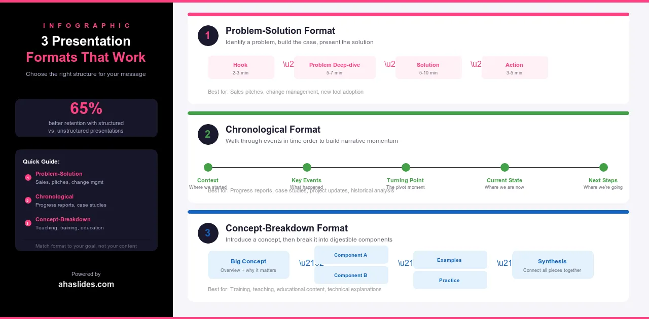
1. 問題解決形式
これは、プロフェッショナルなプレゼンテーションで最も一般的な形式であるのには理由があります。それは、効果的だからです。まず問題点を特定し、なぜそれが重要なのかを説明し、最後に解決策を提示します。不快感と安心感の対比こそが、説得力を生み出すのです。
構成は5つの段階に分かれています。まず、問題を明確にし、単に述べるだけでなく、その深刻さを実感させます。次に、リスクを高めます。この問題を未解決のままにしておくと、金銭的、業務的、あるいは精神的にどのような損失が生じるのかを明確にします。3番目に、解決策を紹介し、なぜそれが症状ではなく根本原因に対処するのかを説明します。4番目に、データ、事例研究、あるいは解決策が機能する様子を示す実演など、証拠を提示します。5番目に、明確な行動喚起で締めくくり、聴衆が次に何をすべきかを正確に理解できるようにします。
この形式は、営業プレゼンテーション、提案、変革管理、新しいプロセスやツールの研修などに活用できます。人々に何か新しいものを採用してもらったり、何かにリソースを投入してもらったり、現在の働き方を変えてもらったりするあらゆる場面で有効です。
例えば、プロジェクト管理ツールを売り込むソフトウェア会社であれば、チームがメール、Slack、スプレッドシートなどを使ってステータス更新を追跡するのに何時間も無駄にしている現状から話を始めるかもしれません。そして、そのコストを数値化するでしょう。次に、自社のプラットフォームを紹介し、実際に動作している様子を見せ、最後に明確な次のステップを提示して締めくくります。どの段階も、次のステップへと繋がる重要な要素です。
2. 時系列形式
この形式は、過去、現在、未来といった時間軸に沿って展開します。あるいは、一連の段階を経て結論へと向かう構成になっています。物語主導型であるため、何かがどのように進化してきたか、状況がどのように展開してきたか、あるいはプロセスがどのように進んできたかといったストーリーを語る際に最適な形式です。
この構成は4つの段階から成ります。まず、物事の始まりと、それを形作った背景から始めます。次に、転換点、つまり方向転換をもたらした出来事、決定、あるいは変化へと進みます。そして現在、つまり現状とそれが意味するところへと至ります。最後に未来、つまり物事がどこに向かっているのか、そしてそこに到達するために何が必要なのかを述べて締めくくります。
この形式は、企業の歴史、業界の変遷に関する講演、変革を示すケーススタディ、そして時間の経過とともに発展していくテーマに関する教育的なプレゼンテーションに適しています。また、組織が現在に至るまでの経緯が、将来の展望と同じくらい重要な意味を持つ、企業文化や価値観に関するプレゼンテーションにも最適です。
ハードウェアからクラウドサービスへと事業転換した企業に関するプレゼンテーションでは、まずその企業の当初のビジネスモデルから始め、変化を余儀なくさせた市場の変化を説明し、現在の状況を詳細に述べ、今後の展望を概説します。聴衆は単に情報を受け取るだけでなく、その道のりを追体験することになります。そして、そうした体験は忘れがたいものとなるでしょう。
3. コンセプト分解フォーマット
この形式は、中心となるアイデアを提示し、それを一つずつ丁寧に解説していくものです。売り込みや物語を語るのではなく、複雑な事柄を分かりやすくすることで、人々が真に理解できるよう手助けするのです。
構造は5つの段階を経て展開されます。詳細に入る前に、まず概念を紹介し、なぜそれが重要なのかを説明しましょう。すべてを一度に提示するのではなく、主要な構成要素に一つずつ分解して説明します。それぞれの構成要素を、具体的で分かりやすい例で示しましょう。各部分がどのようにつながって全体を形成しているかを示します。最後に、応用例で締めくくりましょう。聴衆が学んだことを活用できる方法を提示します。
この形式は、教育的なプレゼンテーション、フレームワークや方法論に関する研修、リーダーシップ、コミュニケーション、意思決定などのスキルに関する専門能力開発講演などに適しています。説得ではなく理解を促すことが目的の場合に最適な選択肢です。
例えば、アイゼンハワー・マトリックスに関するプレゼンテーションでは、緊急度と重要度のフレームワークを紹介し、4つの象限それぞれを実際の例を用いて解説し、それらの関連性を示し、最後に実践的な演習で締めくくります。聴衆は、単に記憶に残るスライドの羅列ではなく、実際に活用できる思考モデルを持ち帰ることができます。
フォーマットを選択する
最適なフォーマットとは、あなたが最も使い慣れているフォーマットではありません。あなたが達成しようとしていることに最も適したフォーマットです。
プレゼンテーション資料を開く前に、次の5つの質問を自問自答してください。主な目的は何ですか?説得、情報提供、説明のどれですか?解決すべき問題がありますか?それとも知識を共有したいのですか?コンテンツは自然な流れや時間軸に沿っていますか?聴衆は誰で、彼らは既に何を知っていますか?このプレゼンテーションは単独で完結するものですか?それとも、あなたが聴衆を導く役割を担いますか?
回答は、適切なフォーマットを示唆してくれるでしょう。誰かに何らかの行動を促したいのであれば、問題解決型がほぼ常に最適な選択肢です。コンテンツに自然な始まり、中間、終わりがある場合は、時系列順の構成が読者にとって直感的に感じられるでしょう。人々が真に理解する必要のある複雑なアイデアを解き明かす場合は、概念分解型の構成を用いることで、途中で読者を見失うことなく、それを効果的に伝えることができます。
迷ったときは、問題解決型のアプローチを基本にしましょう。この3つの中で最も汎用性が高く、他の2つを合わせたよりも多くの状況で有効です。
ハイブリッド形式とバリエーション
プレゼンテーション全体を通して単一の形式にこだわる必要はありません。3つの構成は組み合わせても構いませんが、構成間の移行は意図的なものであり、偶然によるものであってはなりません。
製品発表会では、まず問題解決型のアプローチで製品の存在意義を説明し、次に時系列に沿って開発経緯を語り、最後にコンセプト解説で製品の仕組みを説明するのが一般的です。研修セッションでは、まずコンセプト解説で全体の枠組みを示し、次に各モジュール内で問題解決型のアプローチを用いて、それぞれのスキルが実践においてなぜ重要なのかを説明するのが一般的です。投資家向けプレゼンテーションでは、時系列に沿って企業の歴史と実績を紹介し、次に問題解決型のアプローチで次の成長段階への展望を示すのが一般的です。
ハイブリッド形式がうまく機能しているかどうかを判断する基準は、各移行ポイントで形式を変更した理由を1文で説明できるかどうかです。もし説明できるなら、その構造は意図的なものです。もし説明できないなら、おそらく意図的なものではないでしょう。
フォーマットとビジュアルデザイン
プレゼンテーションの構成は、アウトラインだけでなくスライドにも反映されるべきです。デザインと構成は互いに補強し合うものでなければなりません。そうでなければ、聴衆はたとえ言葉で説明できなくても、その矛盾を感じ取ってしまうのです。
問題解決型のプレゼンテーションでは、視覚的なコントラストが効果的です。問題提起の部分では、暗めで緊張感のある画像や色使いを用いましょう。解決策が明らかになるにつれて、デザインが徐々に開放的になっていくようにすると良いでしょう。視覚的な変化が、感情的な変化をより強く印象づけます。
時系列に沿ったプレゼンテーションは、タイムライン図、ビフォーアフター比較、そして進捗状況を示すビジュアルと相性が良い。各段階は前の段階と少しずつ異なる見た目と雰囲気にすることで、聴衆は単なるスライドの羅列ではなく、時間の経過に伴う変化を実感できる。
概念分解プレゼンテーションには、明瞭な図、フレームワークを示すビジュアル、各構成要素に一貫性のあるアイコンを用いるのが適しています。デザインは、概念の構造を言葉で説明するだけでなく、視覚的に表現するものでなければなりません。
3つのプレゼンテーションすべてに共通する原則が1つあります。それは、スライドが最初から最後まで全く同じように見える場合、そのフォーマットは視覚的な効果を全く発揮していないということです。構成は、単に存在を知っているだけでなく、聴衆が視覚的に認識できるものでなければなりません。

よくある書式の間違い
最もよくある間違いは、コンテンツを書き終えてからフォーマットを決めることです。多くの人は白紙のスライドデッキを開き、書き始め、構成が自然に浮かび上がってくるのを待ちます。結果として出来上がるのは、たいてい2つか3つのフォーマットが混在したもので、うまく繋がりません。その段階で構成をやり直すのは最初からやり直すようなものなので、ほとんどの人はそうしません。スライドを1枚も書き始める前に、フォーマットを決めておきましょう。
2つ目の間違いは、意図せずに形式を混ぜてしまうことです。問題解決型と時系列型のプレゼンテーションを組み合わせることは、意図的な移行であれば素晴らしい効果を発揮します。そうでない場合、聴衆はたとえそれが何であるかを認識できなくても、変化を感じ取ります。話の流れを見失い、構成への信頼を失い、プレゼンテーションの展開を追うのではなく、ただ終わるのを待つようになってしまうのです。
3つ目は、目的に合わないフォーマットを使用していることです。時系列順の構成は物語には効果的ですが、意思決定を求める視聴者にとっては理解しづらいものです。概念の分解は理解を深めるには適していますが、説得には向きません。人々に何らかの行動を促すのであれば、問題解決型のフォーマットがほぼ常に正解です。フォーマットを目的に合わせることは些細なことではありません。それは、行動を起こす準備ができた視聴者と、漠然とした情報しか得られない視聴者との違いを生むのです。
最後の一つは、フォーマットを装飾、つまりテンプレートのように最後に適用するものとして扱うことです。構造は見た目だけのものではありません。それはコンテンツの基盤となる論理です。セクションを入れ替えても何も壊れないのであれば、フォーマットは何の役にも立っていません。
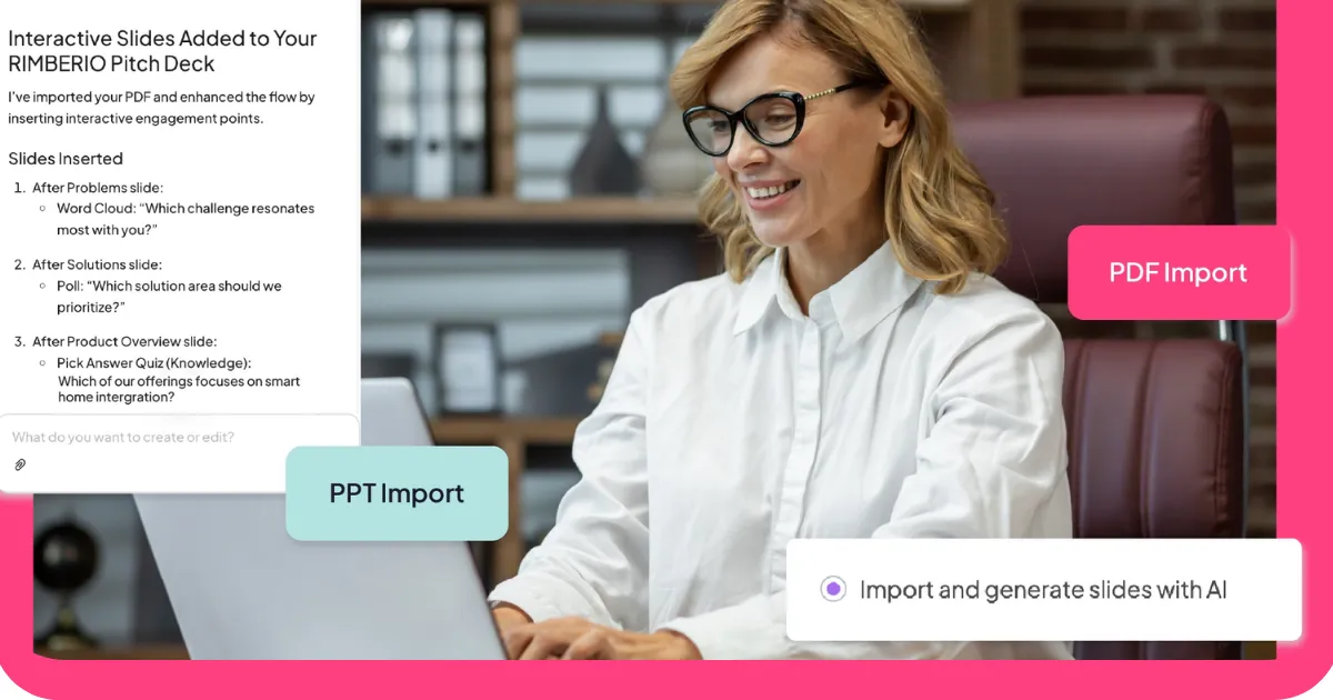
AhaSlidesでさらに進化
インタラクティブな要素は、あらゆるフォーマットに対応できます。重要なのは、視聴者の反応によって構成が強化されたり、内容が視聴者に受け入れられているかどうかをリアルタイムでフィードバックできるようなタイミングで配置することです。
問題解決型のプレゼンテーションでは、まず聴衆にその問題が自分にどの程度影響しているかを評価してもらうアンケートから始めましょう。そうすることで、あなたが何も言わないうちに、問題が個人的なものになります。解決策の段階では、質疑応答のスライドを使って、プレゼンテーションが終わってから反論に気づくのではなく、その場で反論を洗い出しましょう。
時系列に沿ったプレゼンテーションでは、各段階の転換点にワードクラウドを用いることで、聴衆がそれぞれの段階についてどのように感じているかを捉えることができます。「3年前の状況を思い浮かべると、どんな言葉が頭に浮かびますか?」と問いかけることで、感情的なコントラストが生まれ、物語の展開をより効果的に伝えることができます。
概念を細分化するプレゼンテーションでは、各要素の後に簡単なクイズを挟み、次の要素に進む前に理解度を確認しましょう。参加者のほとんどが間違えた場合は、ペースを落とす必要があることがわかります。全員が正解した場合は、ペースを上げて、構成がうまく機能していると判断できます。
フォーマットが論理的な構成を提供し、AhaSlidesは聴衆をその構成に引きつけ続ける。
包み込む
プレゼンテーションの構成は、ほとんどのプレゼンターが偶然に決めてしまうものです。彼らはスライド12枚目あたりでようやく自分の構成に気づきますが、その頃にはすべてをやり直さずに変更するには手遅れになっています。
このガイドで紹介する3つの形式は、プレゼンテーションで必要となる内容の大部分を網羅しています。説得力のあるプレゼンテーションには問題解決型、物語を語るには時系列型、複雑な事柄を説明するには概念分解型が適しています。どの形式も有効です。問題は、どの形式が自分の目的に最も適しているかということです。
デッキを開ける前に決めておこう。そうすれば、あとはすべて楽になる。