עייפות זום היא דבר אמיתי. אנשים יושבים במשרדים הביתיים שלהם לשיחות וידאו רצופות, בוהים ברשת של פרצופים או בשיתוף מסך, וצפוי להישאר מעורבים וממוקדים. זה מתיש קוגניטיבית. ברגע שהמצגת מתחילה, אתם נלחמים בקרב קשה נגד עייפות, הסחות דעת ומשיכת ההתראות.
ההבדל בין מצגת זום שמצליחה להגיע למצגת שאנשים לא מתכוונים להתייחס אליה אינו מסובך. זה מסתכם ביחס שונה לפורמט מאשר מצגת פנים אל פנים. פנים אל פנים, שפת גוף, קשר עין ונוכחות פיזית פועלים לטובתכם. בזום, הכלים הללו מצטמצמים. מחקר AhaSlides נמצא כי 43.9% מהמקצוענים מציינים שימוש במכשירים דיגיטליים ו-41.9% מציינים עייפות מסך כגורמים מובילים להסחת דעת במהלך מצגות, ושתי הבעיות מחמירות בסביבות מרוחקות. עליכם לפצות על ידי הפיכת המצגת שלכם ליותר אינטראקטיבי, דינמי יותר, ומודע יותר לאילוצים של המדיום.
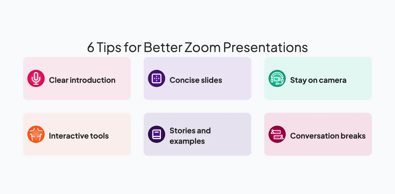
מדריך זה מציע שבעה טיפים מעשיים למצגות בזום אשר מנטרל עייפות וישמור על מעורבות רצינית של הקהל. יישמו את הטכניקות הללו והמצגות שלכם יבלטו מבין עשרות שיחות אחרות שאנשים עוברים מדי שבוע.
1. התחילו עם הקדמה ברורה וידידותית
60 השניות הראשונות חשובות. אנשים מתחברים מוסחים, בודקים אימייל, חוזרים משיחה אחרת. עליכם ללכוד מחדש את תשומת ליבם ולאותת שהשיחה הזו שונה מעדכון סטטוס או תדרוך מידע טיפוסי.
התחילו בברכת אנשים בחום. השתמשו בשמם אם מדובר בקבוצה קטנה. הכירו בכך שאתם יודעים שהם עסוקים. הראו שאתם מעריכים את זמנם על ידי מתן מפת דרכים ברורה: "יש לנו 30 דקות ביחד. אני הולך לכסות שלוש נקודות עיקריות, ואני רוצה לשמוע מכם בדרך."
בדקו את כל הטכנולוגיה שלכם לפני שמתחילים. ודאו שהמיקרופון שלכם עובד, שהמצלמה שלכם ממוקמת היטב, וששיתוף המסך שלכם מוצג כהלכה. תקלות טכניות בהתחלה מאותתות על כך שאתם לא מוכנים, מה שפוגע באמון. התחלה טכנית חלקה מאותתת על יכולת ומקצועיות.
מסגרת הפתיחה שלך מעצבת ציפיות. אם תסמן שמדובר בשיחה ולא בהרצאה, אנשים ניגשים אליה באנרגיה שונה. הם יהיו נוטים יותר להשתתף ופחות לבדוק אימייל.
2. שמרו על מצגות תמציתיות וממוקדות
תשומת הלב כבר נמתחת דק לפני שמתחילים: מחקר מראה שחלון הקשב הממוצע במצגת הוא רק 47 שניות לפני שהמחשבות מתחילות לנדוד. בשיחת זום, חלון זה נדחס עוד יותר על ידי התראות מתחרות והעייפות של שיחות רצופות. רובנו חווינו את הניתוק האיטי שמתרחש באמצע שיחה של 45 דקות. השעמום מתחיל. ריבוי משימות מתחיל.
בנו את מצגת הזום שלכם סביב בלוקים של 10 דקות. כל בלוק צריך לכסות רעיון מרכזי אחד או שתהיה לו מטרה ברורה אחת. לאחר 10 דקות, עברו למשהו אחר. החליפו דוברים במידת האפשר. שאלו שאלה. הציגו סוג אחר של תוכן. שנו את הגירוי ותאימו את תשומת הלב.
אם המצגת שלכם ארוכה מ-30 דקות, שלבו הפסקה של חמש דקות. תנו לאנשים להתרחק, לקחת מים, לבדוק את האימייל שלהם בלי רגשות אשם. ההפסקה מאפסת את תשומת הלב והופכת את המחצית השנייה למרתקת יותר ממה שהייתה בלעדיה.
כבדו את פורמט זום על ידי עיצוב מתאים. מצגת שעובדת בחדר ישיבות עלולה להרגיש מתישה בזום מכיוון שהיא תוכננה עבור מדיום אחר. זום עובד היטב עם קטעים קצרים יותר, אינטראקציה תכופה וסוגי תוכן מגוונים.
3. השתמשו בכלים אינטראקטיביים לאורך המצגת שלכם
שאלו את הקהל שאלות באופן קבוע. אל תחכו לסוף הרצאת שאלות ותשובות. חלקו שאלות לאורך המצגת שלכם כדי לשמור על מעורבות הקהל ולתת להם הזדמנויות לחשוב באופן אקטיבי במקום לקבל באופן פסיבי.
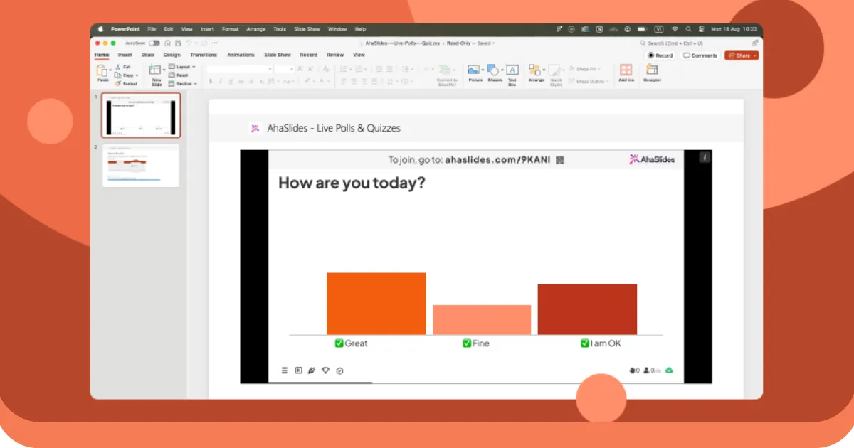
השתמשו בסקרים כדי לאסוף משוב מהיר: "בסולם של 1 עד 5, עד כמה אתם בטוחים לגבי מושג זה?" השתמשו בחידונים כדי לבחון הבנה: "איזו מבין שלוש הגישות הללו הייתם בוחרים ומדוע?" השתמשו ענני מילים לעשות סיעור מוחות: "מה המילה הראשונה שעולה לכם בראש?" השתמשו במפגשי שאלות ותשובות כדי לעלות שאלות אמיתיות: "על מה אתם עדיין תוהים?"
לביצוע חלק, השתמשו בכלים המיועדים לכך. AhaSlides משתלב עם Zoom ומאפשר לכם להטמיע אינטראקטיבי אלמנטים ישירות בשיתוף המסך שלך. המשתתפים רואים את השקופיות שלך ואת הסקר או החידון האינטראקטיבי. הם עונים מהמכשירים שלהם. התוצאות מופיעות בזמן אמת. אתה לא מנהל חלון כלים נפרד; הכל משולב בזרימת המצגת שלך.
אלמנטים אינטראקטיביים משרתים שתי מטרות. ראשית, הם שוברים את המונוטוניות של האזנה לאדם אחד מדבר. שנית, הם יוצרים רגעים שבהם הקהל חייב לחשוב באופן פעיל. מעורבות פעילה זו נלחמת בעייפות זום בצורה יעילה יותר מכל כמות של התלהבות מצד המנחה.
4. ספרו סיפורים בעלי משקל רגשי
קשה לזכור מידע ללא הקשר. אבל מידע המוטמע בסיפור נשאר. בזום, שבו אתם נלחמים על תשומת הלב מול התראות והסחות דעת, סיפורים הם הכלי החזק ביותר שלכם.
בחרו סיפורים שממחישים את הנקודות שלכם. אם אתם מלמדים עובדים חדשים על ערכי החברה, ספרו סיפור על מתי ערכים אלה באו לידי ביטוי בפועל. אם אתם מציגים על פתרון בעיות, ספרו סיפור על בעיה שנתקלתם בה, הגישה הראשונית שלכם, כיצד היא נכשלה ומה למדתם. הספציפיות וקשת הנרטיב הופכים את המידע לבלתי נשכח.
סיפורים גם יוצרים קשר רגשי, אשר נלחם בשטף ובמרחק שאנשים חשים בזום. כשאתה פגיע מספיק כדי לשתף כישלון או רגע של חוסר ודאות, אתה מאותת שאתה אנושי, לא רובוט על המסך. זה גורם לאנשים להיות מוכנים יותר ליצור איתך קשר.
בנו סיפורים עם התחלה, אמצע וסוף ברורים. הימנעו מסבכים. בזום, סיפור מבולגן מאבד אנשים. סיפור מדויק וספציפי שומר על תשומת הלב.
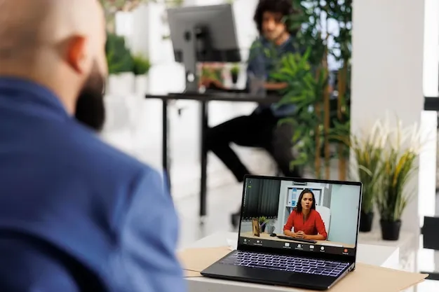
5. הישארו גלויים במצלמה
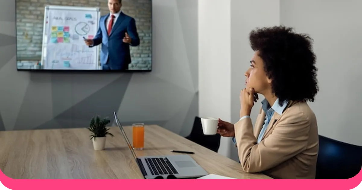
הדחף בזום הוא לעתים קרובות למזער את המצלמה ולמקסם את התוכן שאתם משתפים. אבל אנשים מקיימים אינטראקציה עם אנשים, לא עם שקופיות. כאשר הפנים שלכם גלויות, אנשים רואים את ההבעות שלכם ומרגישים מחוברים יותר. כאשר אתם נעלמים מאחורי התוכן, החוויה הופכת למופשטת ומרוחקת.
השתמשו בתמונה בתוך תמונה אם הגדרות הזום שלכם מאפשרות זאת. הפנים שלכם מופיעות בפינה בזמן שהשקופיות תופסות את רוב המסך. זה שומר על נראותכם תוך הבטחת שהתוכן שלכם קריא. כשאתם מדברים, אנשים רואים אתכם. כשאתם מציגים שקופית, הם רואים את השקופית. האיזון שומר על שני האלמנטים נוכחים.
אם אינכם יכולים לעשות תמונה בתוך תמונה, לפחות חזרו לתצוגת מצלמה מעת לעת. הראו את הפנים שלכם. צרו קשר עין עם המצלמה. חייכו. הרמזים הפיזיים האלה חשובים יותר בזום מאשר במציאות, כי הם הרמזים היחידים הזמינים.
בנוסף, היו מכוונים לגבי ההתקנה שלכם. הרקע שלכם צריך להיות מקצועי או בכוונה לא רשמי, בהתאם לקהל שלכם. תאורה טובה גורמת לכם להיראות מעורבים ונוכחים. התקנה גרועה גורמת לכם להיראות כאילו לא היה לכם מספיק אכפת כדי להתכונן. פרטים קטנים מעידים על כבוד לזמן של הקהל שלכם.
6. שלבו הפסקות שיחה
מצגות הן תקשורת חד-כיוונית. שיחות הן דו-כיווניות. בזום, שבו אנשים כבר מנותקים, האיזון אמור לנוע יותר לכיוון השיחה.
לאחר כיסוי נקודה מרכזית, עצרו ובקשו תגובות. "האם זה מהדהד עם החוויה שלכם?" או "אילו שאלות זה מעלה?" תנו לאנשים מרחב להגיב. עבור קבוצות גדולות, השתמשו בצ'אט. עבור קבוצות קטנות יותר, בקשו מהאנשים לבטל את ההשתקה ולשתף. עבור קבוצה בכל גודל, אתם יוצרים רגע שבו התקשורת זורמת לשני הכיוונים במקום רק מכם אליהם.
אם יש לכם מספר דוברים או מנחים, החליפו אותם כל 10 דקות. קול חדש מרענן את תשומת הלב. שיחה הלוך ושוב בין שני אנשים מרתקת יותר ממונולוג של אדם אחד.
בנו את המצגת שלכם כסדרה של הרצאות קצרות ואחריהן שיחות, ולא הרצאה אחת ארוכה ואחריה שאלות. הקצב הקבוע של דיבור-אז-הקשבה-ואז-דיבור שומר על מעורבות הקהל.
7. השתמשו בסוגי תוכן מגוונים
טקסט בשקופיות הופך קשה לקריאה בזום כאשר אנשים רבים צופים במסכים קטנים יותר. תמונות עובדות טוב יותר ממילים. סרטונים עובדים טוב יותר משניהם. ויזואליזציות נתונים מרתקות יותר מטבלאות של מספרים. מגוון בסוג התוכן שומר על תשומת הלב טוב יותר מאשר שימוש באותו פורמט לכל אורך התצוגה.
עברו בין שקופיות, סרטונים, סקרים, שאלות ותשובות ומצלמת המציג לאורך כל המצגת. כשאתם עוברים בין שיטות שונות אלה, אתם מונעים את ההסתגלות המוחית שמובילה לחוסר ריכוז. גירויים חדשים שומרים על אנשים ערניים.
שמרו על מינימליות של טקסט. השתמשו בגופנים גדולים וברורים. השתמשו בניגודיות גבוהה בין הטקסט לרקע. בדקו שהשקופיות שלכם קריאות בעת שיתוף בזום. מציגים רבים יוצרים שקופיות שעובדות מצוין פנים אל פנים אך הופכות לבלתי קריאות בשיתוף מסך.
הרכבת הכל: מבנה מצגת בזום
כך עשויה להתנהל מצגת זום בת 30 דקות, תוך שילוב העקרונות הבאים:
דקות 0-2קבלת פנים חמה, שמות אם זו קבוצה קטנה, מפת דרכים ברורה של מה שמצפה לכם.
דקות 2-10נקודה עיקרית ראשונה. שמרו על עיקרון מדויק, רעיון אחד, המגובה בסיפור או ויזואליה.
דקות 10-12רגע אינטראקטיבי. סקר, ענן מילים או שאלה ישירה לקבוצה.
דקות 12-20נקודה עיקרית שנייה. החליפו רמקולים אם אתם יכולים. קול חדש, תשומת לב רעננה.
דקות 20-22רגע אינטראקטיבי נוסף. שאלות ותשובות, תגובות בצ'אט או חידון קצר.
דקות 22-28נקודה עיקרית שלישית. הנקודה החזקה ביותר שלך כאן, לא ראשונה. אנשים זוכרים את מה ששמעו אחרון.
דקות 28-30סגור עם קריאה ברורה לפעולה. מה אתה רוצה שאנשים יעשו, יחשבו או יחליטו אחרי השיחה הזו?
אף קטע לא נמשך יותר מעשר דקות. כל רגע אינטראקטיבי מאפס את תשומת הלב. המבנה עושה חצי מהעבודה בשבילכם.
העיקרון הבסיסי
עייפות זום לא באמת קשורה למסכים. זה קשור לכך שמדברים עליך יותר מדי זמן בלי סיבה להישאר נוכח.
התיקון אינו מצגת טובה יותר או חיבור אינטרנט מהיר יותר. זה לתת לאנשים משהו לעשות, משהו להגיב לו, משהו שיגרום לשיחה להרגיש כאילו היה שווה להופיע בשבילה.
תעשו את זה, והמסך יפסיק להיות מחסום. הוא יהפוך לחדר.