Editor's note (September 2025): This post is outdated. For our most current branding information and announcement, please see our newer article: AhaSlides’ New Chapter: Our Rebranding Announcement.
There's a time to be bold and colourful.
For those giving a do-or-die presentation, running an interactive team meeting, or hosting a quiz night for their friends, that time is the present.
Because the present belongs to presenters.
AhaSlides is taking a step into the bold and colourful, too. Our new branding represents the strength, emotion and interconnectivity of the perfect presentation. Whether you're using us for work, school, community, or whatever, we're sure you'll find a piece of yourself in the new AhaSlides.
Click below to see AhaSlides' new branding in action 👇
#1: The Logo Mark
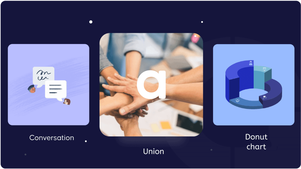
The new, circular logo mark was born of a few different ideas:
- The symbol of a speech bubble, representing two-sided conversation.
- The roundedness of a circle, representing coming together in union.
- The joined segments of a donut chart, representing visuals and graphs.
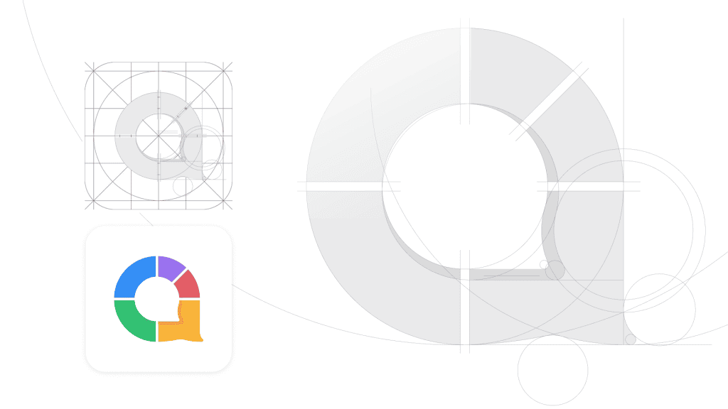
All of this comes together to form the letter 'a' - the first letter of AhaSlides. It's the uniting essence of how we connect upon shared ideas.
This grid system of the logo mark reveals how key the idea of the circle is to the mark.
Breaking down the shape in this way shows how the mark will fit in with the standard guidelines for iOS and Android app icons.
#2: Colour
As we've grown to learn the breadth of emotion inherent in interactivity, so too has our colour palette.
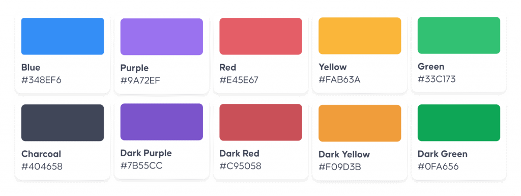
From the traditional blue and yellow, the new logo expands its range across the 5 bold segments of colour, each representing emotions and virtues:
- Blue for intelligence and security
- Red for passion and excitment
- Green for growth and versatility
- Purple for trust and luxury
- Yellow for friendliness and accessibility
Together, the range of colours denote the diversity of the software and the presentations that happen within it. From lessons in high school and meetings in board rooms to quiz nights, church sermons and baby showers, the colours of connectivity remain powerful and prominent.
#3: Typography
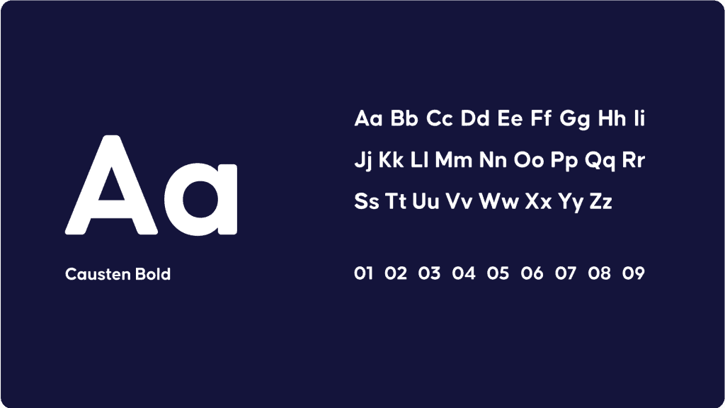
The Causten font brings elegance, structure and modernity to the logo. It's a geometric sans serif font with a tidy appearance and clear visibility, helping it to stand out on the website, the presenter app and the audience app.
All 3 elements come together to form our new logo...


The Story of the Logo
Reinventing our brand identity was a big undertaking.
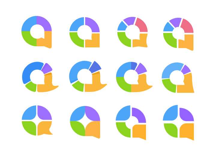
It began as far back as November 2020, when our head designer Trang Tran began sketching out some early ideas.
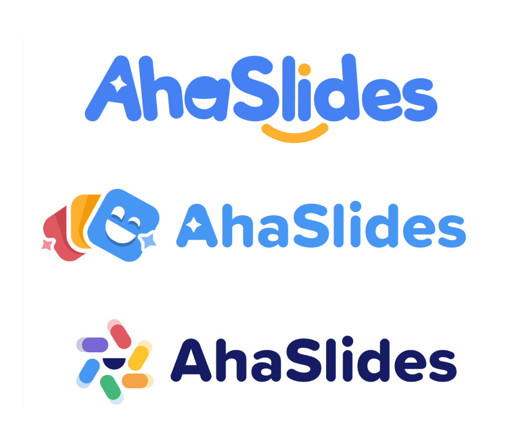
Those ideas took the bright blue and yellow elements of the original logo, but manifested the concept of 'joy' in different ways:
We decided to press ahead with the final version here. The slick font, dark text and the abundance of colour proved to be a great combination for what we were looking for.
Trang found that her toughest challenge was the logo mark. She worked tirelessly to create an all-encompassing mark that could be used by itself to reflect the ideas for which AhaSlides stands:
Creating a logo mark was certainly the part of this project that I devoted the most time to. It had to encapsulate so many different ideas, but also be simple and attractive. I'm super happy with how it turned out!
Trang Tran - Head Designer
Over the next few weeks, you'll see the new logo updated across our website, presenter app and audience app. We'll be as quiet as possible when making the updates so we don't disturb you during your important work.
Thank you for continuing to support AhaSlides. We hope you love the new logo as much as we do!

