
.webp)
Complex systems — from cellular communication to data-processing workflows — often overwhelm learners when presented verbally.
In a 2016 study published in Cognitive Research: Principles and Implications, Eliza Bobek and Barbara Tversky demonstrated that constructing visual explanations helps learners organize and internalize complex information far more effectively than words alone.
Their findings highlight a core truth about how people learn: our brains don’t just hear information — they see it. Whether you’re training medical professionals, insurance agents, or corporate teams, visuals bridge the gap between abstract concepts and real understanding.
Let’s explore why visuals have such a powerful effect on memory and comprehension — and how trainers can use these insights to design sessions that truly stick.
🧠 The science behind visual learning and memory
If you’ve ever struggled to explain a complex topic and found that one good diagram suddenly made everything “click,” there’s science behind that moment. Visuals work because they engage how the human brain naturally processes information.
1. Dual coding: activating two learning channels
Psychologist Allan Paivio proposed the Dual Coding Theory (1991), which shows that people understand and remember better when information is encoded in both verbal and visual forms.
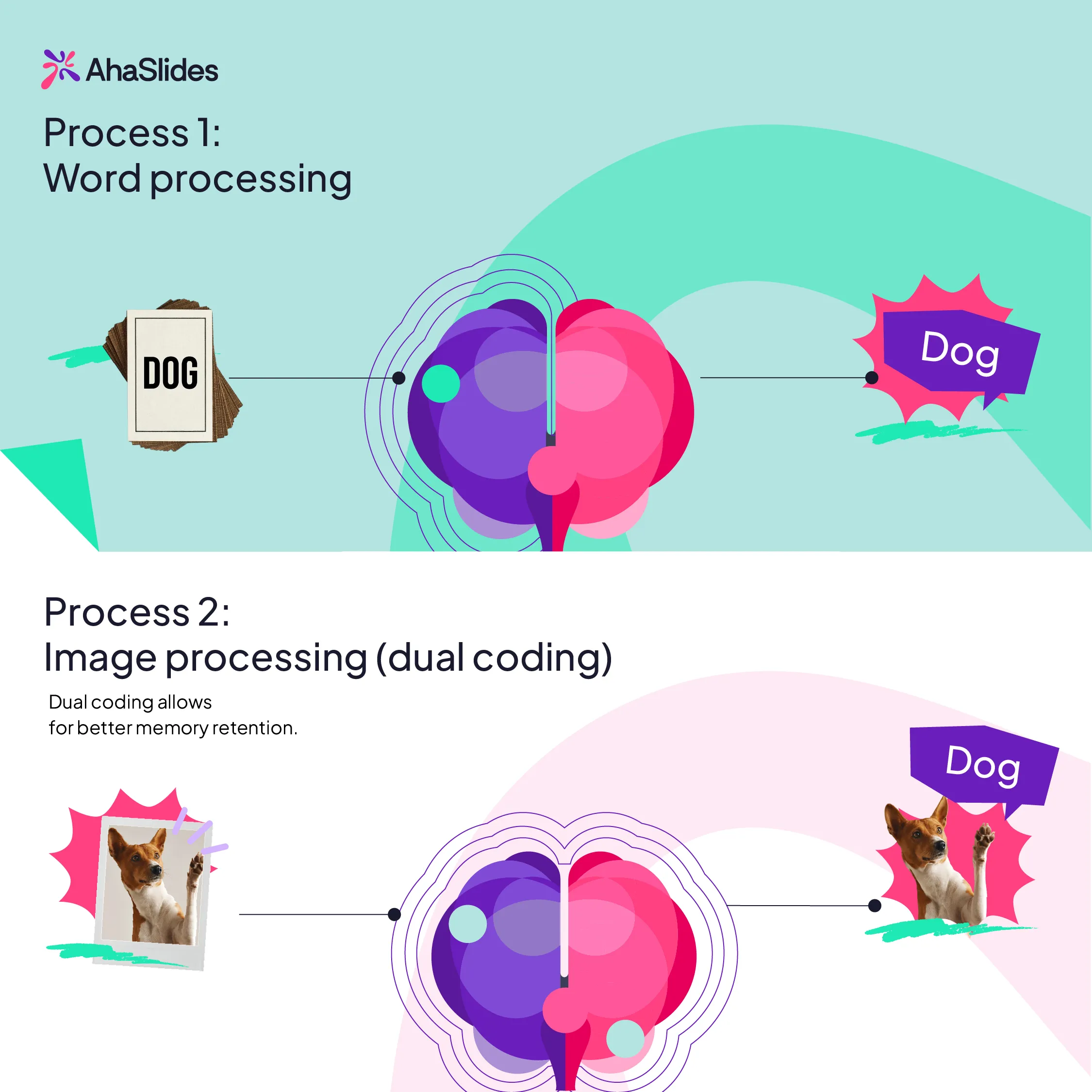
When trainers speak and show visuals together — like an image, a process map, or an interactive slide — learners create two mental pathways to recall that information later.
🧩 Practical takeaway: Instead of reading from your slides, use visuals to complement what you say, not duplicate it.
2. Why visuals outperform text: less overload, more memory
Educational psychologist Richard Mayer and psychologist Lionel Standing both arrived at a shared truth through different lenses: visuals stick because they’re easier to process and harder to forget.
Mayer’s Cognitive Theory of Multimedia Learning (2009) explains that people learn best when visuals and words work together — not compete — since our working memory can only handle limited information at once. Meanwhile, Standing’s (1973) picture superiority effect proved that humans remember images far more reliably than words. Combined, their findings show why effective training visuals must be clear, intentional, and memorable.
📊 Example: Instead of listing every policy type on a text-heavy slide, use a visual comparison chart — it instantly communicates relationships and differences without overloading learners’ memory.
🎨 From information to insight: how to teach visually
Once you understand why visuals work, the next challenge is using them deliberately.
Great visuals don’t just decorate slides — they guide thinking, helping learners see relationships, patterns, and meaning. Whether you’re teaching anatomy or explaining an insurance process, visual teaching follows three core principles: structure, story, and simplicity.
1. Structure: turn chaos into patterns
Our brains crave order. When information is unstructured — long lists, dense text, scattered examples — learners have to build their own mental framework, which consumes working memory. A visual structure does that work for them.
🧩 Try this:
- Replace bullet lists with diagrams that group, compare, or connect.
- Use flowcharts to show process logic (e.g., decision trees, cause–effect).
- Apply visual chunking — limit slides to one core idea, with supporting icons or arrows to show hierarchy.
💡 Tip: The moment you can describe your content as “steps,” “categories,” or “relationships,” it’s a candidate for visualization.
But why stop there? Trainers can turn this passive clarity into active learning.
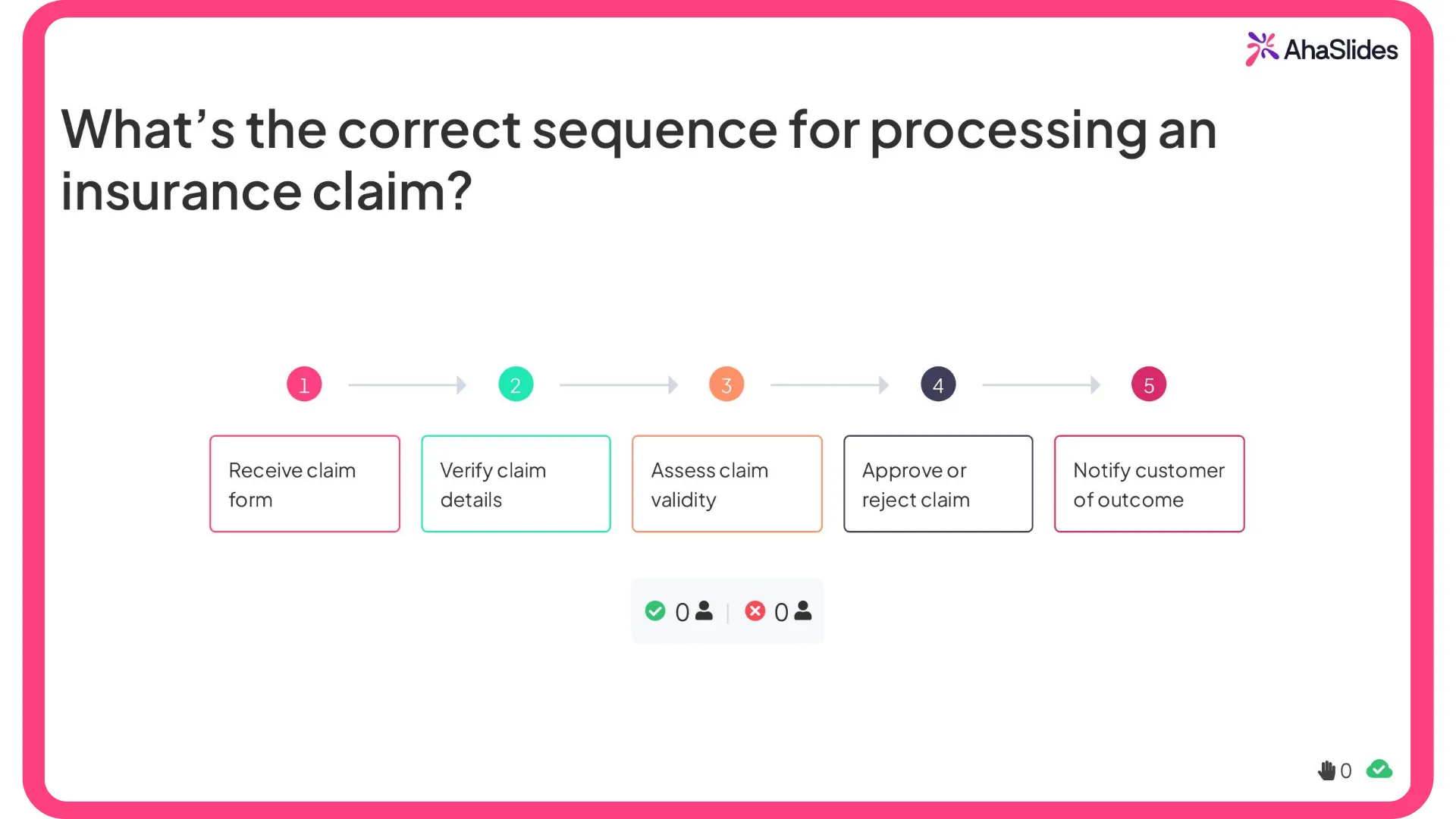
💡 AhaSlides in action: visualize and reinforce with interaction
Try using a “Correct Order” quiz slide (or any interactive sequencing method) to transform a linear process into a visual challenge.
Rather than reading through bullet points, participants drag and drop steps into the right order — engaging both their visual and verbal reasoning systems.
Example:
Question: What’s the correct sequence for processing an insurance claim?
Options (shuffled):
- Verify claim details
- Receive claim form
- Assess claim validity
- Approve or reject claim
- Notify customer of outcome
Checklist for visual simplicity
As participants submit their answers, they instantly see the correct order visualized on screen — a live demonstration of dual coding and cognitive efficiency in action.
🎯 Why it works:
- Converts static information into an interactive sequence learners can see and do.
- Reduces cognitive load by chunking steps visually.
- Strengthens recall through the picture superiority effect — learners remember the flow as a mental image, not just a list.
💬 Pro tip: Follow up the quiz with a simple flowchart on the next slide to visually reinforce the process. Interactivity plus structure = long-term retention.
2. Story: use visuals to reveal cause and consequence
Storytelling in training isn’t about fiction — it’s about sequence and purpose. Each visual should move the learner from:
What is happening? → Why does it matter? → What should be done differently?
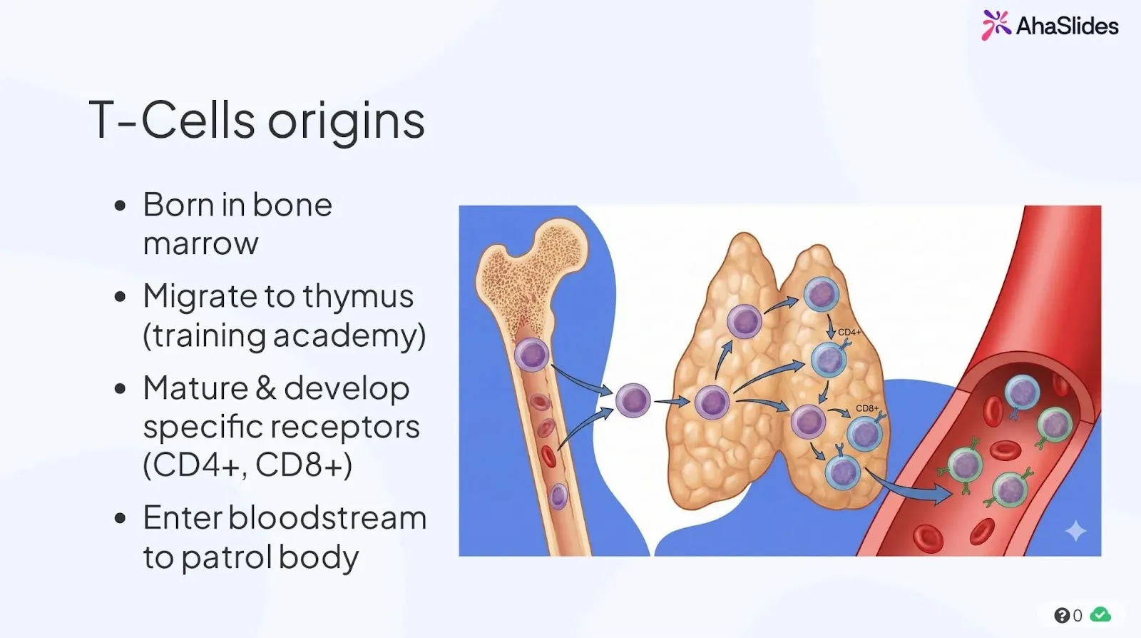
One of the simplest ways to apply this in nursing and medical training is through short scenario videos paired with guided analysis.
🎬 Example:
Play a brief clinical video showing a patient interaction or procedure (for example, from educational platforms like Osmosis or NurseLabs).
After viewing, ask learners to:
- Identify what went wrong or what was done well.
- Discuss the key decision moments in the scene.
- Create a visual workflow or checklist that maps the ideal clinical process.
This watch → analyze → visualize sequence turns viewing into active clinical reasoning, helping learners remember not only what to do but why each step matters.
3. Simplicity: remove noise to increase meaning
Cognitive load theory reminds us that more isn’t better — clarity beats complexity. Every extra word, color, or shape adds mental effort.
📋 Checklist for visual simplicity:
- Use one visual purpose per slide (explain, compare, or show change).
- Reduce text — captions should guide attention, not repeat what you say.
- Keep color meaningful: use contrast to highlight, not decorate.
- Avoid stock imagery that doesn’t reinforce learning goals.
🧠 Remember: White space is part of design. It gives the brain room to think.
4. Reflection: help learners visualize their own thinking
The deepest learning happens when participants can draw, map, or model their own understanding. Visual reflection externalizes thought — turning memory into knowledge.
🖍️ Ideas you can apply:
- Ask learners to sketch a system or process from memory (no art skills required).
- Use mind maps or concept diagrams as discussion summaries.
- Encourage note-taking in symbols and arrows rather than full sentences.
To capture and share these learner-created visuals in one place, you can use an embed slide (for example, AhaSlides’ Embed slide) to bring in an online whiteboard, diagram tool, or shared document directly into your session — so everyone’s visual thinking becomes part of the live learning experience.
💡 Why it matters: According to research by Fiorella & Zhang (2016), learners who create their own visual explanations remember and transfer knowledge more effectively than those who only read or listen.
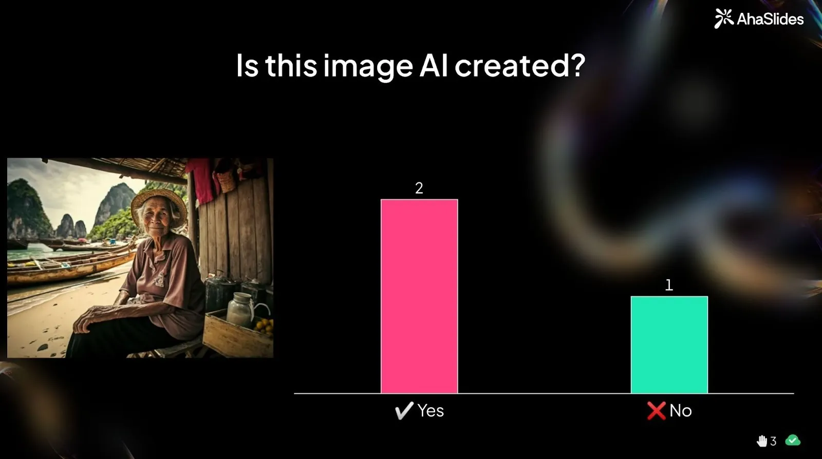
5. Image quiz: training the eye, not just the memory
Visuals aren’t only powerful for explaining concepts — they’re equally powerful for testing real-world observation skills. Rather than asking learners to recall definitions, image-based quizzes present a visual scenario and ask learners to analyze what they see.
🔍 Example:
Show an image and ask:
“Is this image AI-generated or real?”
Participants vote first, then receive guided feedback pointing to visual clues — such as awkward anatomy, inconsistent lighting, or unnatural proportions (for example, unusually long fingers or distorted arm placement).
This form of visual questioning helps learners practice pattern recognition and critical evaluation — skills that are useful in any professional setting where visual information needs to be assessed quickly and accurately.
💡 Why it works:
- Strengthens visual attention and discernment rather than rote recall.
- Mirrors real-world decision-making, where subtle details often matter more than memorized rules.
- Engages curiosity and discussion, which enhances memory retention.

🧩 Conclusion: the visual advantage
For decades, trainers have relied on text and talk — but the brain was never built to learn that way.
Research across psychology and education keeps proving the same point: when people see ideas, they don’t just remember them — they understand them.
Visuals reduce noise, reveal meaning, and help learners connect what they know with what they’re learning.
From anatomy to insurance, from systems to strategy, the visual advantage lies in helping people build mental models — compact stories they can recall long after the session ends.
In a world flooded with information, clarity is your greatest teaching tool. And clarity begins when you stop telling — and start showing.