The past few months at AhaSlides have been a time of reflection. What do our users love about us? Where are we heading? And what can we do better?
Our old look served us well.
Bless it.
But it was time for something new.
We wanted to hold onto what you love — our simplicity, affordability, and playful nature — while adding some “umph” to match where we’re going.
Something bold.
Something ready for the big stage.
Why?
Because our mission is larger than ever:
To save the world from sleepy meetings, boring training, and tuned-out teams—one engaging slide at a time.
The power of Aha moments in a distracted world
If our name didn’t give it away… we really believe in aha moments.
You know the ones. Your audience is hooked. Questions fly. Answers spark more curiosity — all of it flowing, fast and focused. There’s energy in the room. A buzz. A feeling that something’s clicking.
These are the moments that make your message stick.
They help trainers train, learners learn, speakers inspire, and teams align.
But these moments are becoming rare in an increasingly distracted world.
The average on-screen attention span has dropped from 2.5 minutes to just 45 seconds during the last two decades. There’s something lurking on the shoulder of your audience, urging them to check TikTok, scroll something else, think about dinner. Anything. It’s crashing your presentations uninvited and eating away at your productivity, learning, and connection.
We’re here to change that; to give every presenter — whether in a classroom, boardroom, webinar or workshop — easy access to “attention reset” tools that actually make people want to participate.
We’ve refreshed our look to match the impact we want to make.
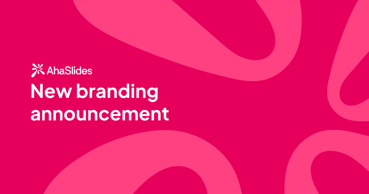
So what’s new with the AhaSlides brand?
The new AhaSlides logo
First up: the new logo. You may have spotted it already.
We’ve gone for a more confident and timeless typeface. And we’ve introduced a symbol that we’re calling the Aha “Splash.” It represents that moment of clarity, the sudden spark of attention — and the touch of playfulness our product brings to even the most serious of sessions.
Our colours
We’ve gone from full rainbow to a more focused palette: a vibrant pink, deep purple, dark blue and confident white.

What can we say? We’ve grown up.
Our themes
We’ve also introduced new presentation themes designed to balance clarity, energy, and style — and yes, they still come with that sprinkling of AhaSlides magic you’ve come to love.

Same Aha. Bigger mission. Sharper look.
What we stand for hasn’t changed.
We’re still the same team — curious, kind and slightly obsessed with the science of engagement.
We’re still building for you; the trainers, teachers, speakers and presenters who want to harness the power of engagement to make meaningful impact at work.
We just wanted to look slicker in doing it.
Love it? Hate it? Tell us!
We’d love to hear your thoughts. Drop us a message, tag us on social, or simply give the new look a spin with your next presentation.