

Numbers don't speak for themselves. A spreadsheet full of data tells your audience nothing until someone makes a decision: what does this actually mean, and what's the best way to show it?
That decision matters more than most people realize. The same dataset presented as a table, a line graph, or a scatter plot tells three completely different stories. Pick the wrong format and you lose the room. Pick the right one and the insight lands before you've said a word.
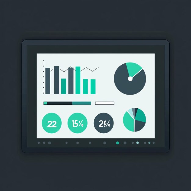
Here are ten ways to present data, and exactly when to use each one.
1. Tables
Tables organize data into rows and columns, presenting exact values for easy reference and comparison. They work best when your audience needs to look up specific numbers or compare multiple data points across several categories.
Best for: Financial reports, inventory lists, survey results with many variables, or any situation where precision matters more than pattern recognition.
Example: Comparing Q4 revenue across five product lines with exact figures. Each line item shows name, units sold, revenue, profit margin, and year-over-year growth. Stakeholders can drill into specifics while seeing the full context.
Limitation: Tables don't reveal trends or highlight outliers as effectively as other formats. Dense tables become overwhelming quickly. Keep to maximum seven rows and six columns for clarity.
2. Text-based data
Sometimes the most important data point is a single number or statistic embedded in flowing prose. Text-based data works for narratives where you're explaining context, not just presenting figures.
Best for: Executive summaries, storytelling, case studies, or communicating research findings where interpretation matters as much as the raw numbers.
Example: "Over the past three years, our customer retention rate improved from 73% to 91%, driven primarily by our onboarding program redesign. This 18-point increase translates to $2.3 million in retained annual revenue." The numbers gain meaning through context.
Limitation: Text-based data requires careful reading. It's easy to miss key points when numbers are buried in paragraphs. Reserve this method for situations where narrative is essential.

3. Pie charts
Pie charts show parts of a whole as slices, with each slice's size proportional to its percentage of the total. They excel at showing composition when you're dividing something that totals 100%.
Best for: Budget allocation, market share distribution, breakdown of survey responses into categories, or showing how a resource is divided.
Example: Marketing budget allocation showing 40% for digital advertising, 25% for events, 20% for content, 10% for tools, and 5% for testing. The pie immediately shows digital dominance and relative proportions.
Limitation: Pie charts work only with 2-5 categories. Beyond that, they become difficult to interpret and compare. Never use 3D effects, which distort perception. Many data experts argue against pie charts entirely when bar charts would work, and they're right for comparisons across many categories.
4. Bar charts
Bar charts use rectangular bars to show values across categories. Horizontal or vertical orientation both work depending on context. Bar charts excel at comparing values and are arguably the most versatile data visualization format.
Best for: Comparing sales across regions, showing performance metrics for different teams, displaying survey response frequencies, or comparing any categorical data.
Example: Showing customer satisfaction scores (0-10 scale) across five company departments. Bars make it clear immediately that Operations scores highest (8.2) and IT scores lowest (6.8). Viewers can see ranking and approximate values instantly.
Limitation: Bar charts work less effectively for showing change over time, especially when you have many time periods. They also struggle with very large datasets that would require hundreds of bars.
5. Histograms
Histograms resemble bar charts but represent distribution of a continuous variable. Unlike regular bar charts with gaps between bars, histograms have bars touching because they represent a continuous range divided into intervals.
Best for: Showing how a population is distributed, such as age distribution, salary ranges, response time distribution, or test score frequencies.
Example: Customer age distribution showing a concentration of customers aged 25-34 (peak), with tapering numbers in younger and older age groups. This reveals your core demographic instantly.
Limitation: Histograms require selecting appropriate interval sizes. Too narrow and you see noise. Too wide and you lose meaningful detail. They're also not widely understood by non-technical audiences.
6. Line graphs
Line graphs connect data points with lines, showing trends and changes over time. They're perfect for tracking variables that fluctuate or progress sequentially.
Best for: Stock price movements, website traffic over months, temperature variations, revenue trends, user growth, or any metric you want to watch over time.
Example: Monthly website traffic for the past year showing a dip in July (summer slowdown) and a spike in October (product launch). Multiple lines can show different channels: organic search trending up, social media flat, paid ads increasing. The trends and intersections tell the story instantly.
Limitation: Line graphs show patterns but obscure exact values compared to tables. They also become cluttered with too many overlapping lines. Limit to three or four concurrent lines.
One format worth mentioning separately: live data visualization during presentations. Tools like AhaSlides let you run polls, word clouds, and Q&A in real time, with results visualizing on screen as your audience responds. It's not just engaging, it's also the fastest way to collect and display audience data without preparing a single chart in advance. The room becomes the dataset.
7. Pictograms
Pictograms use icons or illustrations to represent data points, making them accessible and engaging. Each icon represents a unit or a larger quantity. They work best with smaller datasets that you want to make visually appealing.
Best for: Infographics, presentations to general audiences, or any situation where making data feel friendly and approachable matters.
Example: Survey asking "How many hours per week do you exercise?" Show small running figures where each figure represents five people. Ten people who answered "none" would show two figures. This is more engaging than a simple number.
Limitation: Pictograms work only with whole numbers and relatively small datasets. They're harder to read with large quantities. They also take more space than other formats.
8. Radar charts
Radar charts, also called spider charts, display multivariate data across multiple axes radiating from a central point. Each axis represents a different variable, with values plotted as a polygon.
Best for: Comparing profiles or performance across many dimensions simultaneously, skill assessments, or showing strengths and weaknesses at a glance.
Example: Comparing two competitive products across six dimensions: price, quality, ease of use, customer support, feature completeness, and security. One product might excel at price and ease of use but lag on features. The other might shine on quality and features but cost more. The shapes reveal each profile instantly.
Limitation: Radar charts are less precise than other formats and harder for audiences unfamiliar with them to interpret. They work best with 3-7 axes. More than that and they become visual clutter.
9. Heat maps
Heat maps use color intensity to represent data density or frequency. Darker or warmer colors typically indicate higher values or greater concentration. They're excellent for revealing patterns and outliers across two dimensions.
Best for: Time-based patterns (website traffic by hour and day), geographic data, activity matrices, or any data you want to highlight concentration and clusters.
Example: Website traffic by hour of day and day of week reveals that Tuesdays at 10am are peak traffic times, Sundays are quiet, and nights are slow. The color gradation (cool blue for low traffic, hot red for high traffic) makes patterns jump out without reading numbers.
Limitation: Heat maps work best with specific data types and lose effectiveness when values don't vary much. Color interpretation also depends on viewer color perception, so accessibility matters.
10. Scatter plots
Scatter plots show two related variables as individual points on an x-y axis, revealing relationships and correlations. They answer questions like "Do these two variables move together?"
Best for: Correlation analysis, outlier identification, identifying relationships between variables, or quality control charts.
Example: Plotting customer lifetime value (y-axis) against product adoption speed measured in days (x-axis) reveals whether faster adoption predicts higher value. Points clustering in the upper left suggest fast adopters spend more. Outliers below suggest some fast adopters don't convert to high-value customers. This insight informs customer acquisition strategy.
Limitation: Scatter plots show correlation, not causation. They can become cluttered with large datasets and may obscure precise values. They're also less intuitive for general audiences compared to bar or line charts.
Choosing the right method
No single format works for everything. The right choice comes down to three things: what your data actually is, who's reading it, and what you need them to walk away understanding.
Start with the data. Comparing categories points you toward bar charts. Tracking something over time means line graphs. Showing composition calls for a pie chart. Exploring relationships between two variables is a job for scatter plots.
Then consider your audience. Heat maps and radar charts work well for technical readers who are comfortable interpreting unfamiliar formats. For general audiences, stick to bars, lines, and pies. Familiarity beats sophistication every time.
Finally, a few things that apply regardless of format: skip the 3D effects, they distort more than they impress. Label everything. Include your source. And if a decorative element isn't adding information, it's taking something away.

Data visualization isn't about making numbers look nice. It's about making them impossible to ignore.
The right format does the arguing for you. Your audience sees the pattern, feels the gap, understands the trend, before you've explained a thing. Get that right, and the data doesn't need a spokesperson. It speaks for itself.