
Most survey data goes nowhere. Teams run the survey, compile the numbers, and then build a survey result presentation that lists every question and its percentage breakdown. Stakeholders nod through the meeting, the deck gets filed away, and nothing changes. Sound familiar?
The problem is rarely the data. It's the presentation. This guide covers how to structure, visualize, and deliver survey results so the findings drive decisions rather than fill an archive folder. A McKinsey Global Institute report found that data-driven organizations are 23 times more likely to acquire customers and 19 times more likely to be profitable, yet most survey findings never translate into decisions because they are presented without a clear narrative [5].
What a survey result presentation actually needs to do
Before choosing a chart type or writing a title slide, be clear about the job the presentation has to do. A survey result presentation has to do three things:
- Tell the audience what you found
- Explain why it matters to them specifically
- Point toward what should happen next
Everything else is decoration. Executives sitting through a presentation on employee engagement data are not there to review methodology. They want to know what the numbers say about the state of the organization and what should change. HR professionals reviewing training evaluation results want to know which programs are working and which ones need to be redesigned. The frame matters before the first slide.
Step 1: Know your audience before you build anything
The same survey data needs to be packaged differently depending on who is in the room. A detailed breakdown of Likert scale distributions across ten questions is appropriate for a team of HR analysts. The same information presented to a CFO needs to be compressed into two or three headline findings tied directly to business outcomes.
Before building your deck or report, answer these questions:
- What decision does this audience need to make?
- How much context do they already have about the survey and its goals?
- How much time will they have to review or sit through the presentation?
- What level of statistical detail will they find useful versus overwhelming?
For leadership audiences, lead with the most important finding. For practitioner audiences, you can layer in more detail. For mixed rooms, structure the presentation so the headline findings come first and the supporting data comes later, so stakeholders can exit after the key takeaways and the analytical team can stay for the rest.
Step 2: Filter the data before you visualize it
A 30-question survey generates 30 data points, but that does not mean you present all 30. Most surveys have three to five findings that actually matter for the decisions at hand. The rest is context at best, noise at worst.
Go through your results and ask: which findings are surprising, significant, or actionable? A question where 94% of respondents gave the same answer tells you almost nothing useful: it can probably be cut. A question where responses split sharply between departments, or where the trend has shifted significantly since the last survey cycle, usually belongs in the presentation.
This filtering step is where most presenters underinvest. Showing everything feels thorough, but it works like highlighting every line in a textbook: when everything is marked as important, nothing is.
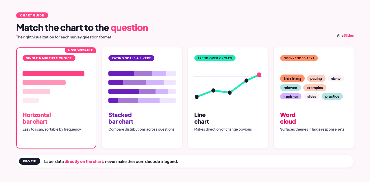
Step 3: Choose chart types that match the data
Different question formats call for different visualizations. Using the wrong chart type makes accurate data harder to understand.
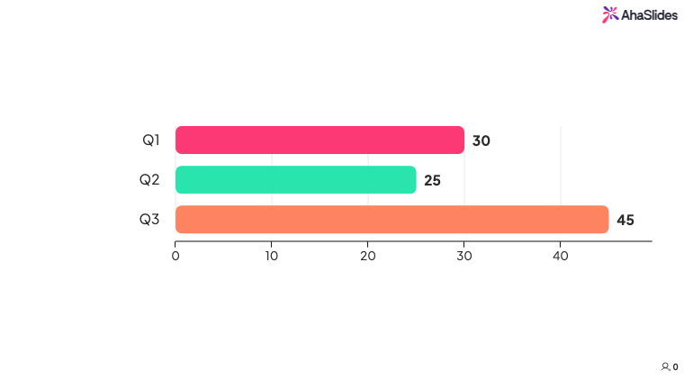
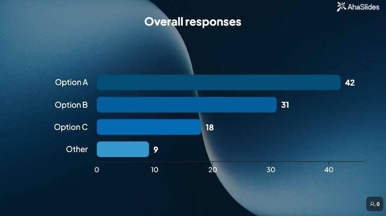
Single-choice and multiple-choice questions work well as horizontal bar charts. Bar charts are easy to scan, handle any number of categories, and allow you to sort responses by frequency so patterns are immediately visible [1]. Pie charts work for single-choice questions with four or fewer options where the proportion-to-whole story is the main point, but they become hard to read with more than five slices.
Rating scale and Likert questions are best shown as stacked bar charts, where each bar represents one question and the segments show the distribution of responses across the scale [2]. This lets you compare response patterns across multiple questions in a single visual.
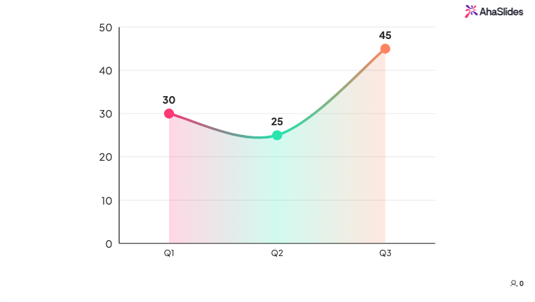
Trend data, where you compare results from this cycle to a previous one, works best as a simple line chart or a side-by-side bar comparison. The goal is to make the direction of change obvious at a glance.
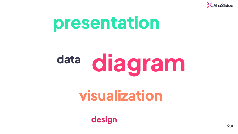
Open-ended text responses don't need to be presented as raw quotes (though a few well-chosen quotes can be powerful). Word clouds can surface the most frequently used terms quickly, which is useful for spotting themes in large response sets.
One consistent rule across all chart types: label the data directly on the chart rather than relying on legends. Audiences should not have to cross-reference a color key to understand what they are looking at.
Step 4: Build a narrative, not a list
The difference between a useful presentation and a forgettable one often comes down to whether the presenter tried to tell a story or just report the numbers [3].
A narrative structure for survey results typically looks like this:
Context: What was the survey about, who responded, and when was it run? Keep this to one slide or a few sentences. The audience needs enough to trust the data, not a full methodology report.
Key finding: Start with the most important result. Frame it as a statement, not a question. "Sixty-two percent of employees say they don't have enough information about decisions that affect their work" is a finding. "What do employees think about internal communication?" is a prompt, not a finding.
Supporting detail: Two or three data points that add depth to the headline finding. This is where chart-heavy slides earn their place.
Comparison or context: How does this compare to a previous survey period, to an industry benchmark, or to a different team or department? Numbers are more meaningful in relation to something.
Implication: What does this finding mean in practice? This is where you connect the data to the decisions the audience needs to make.
Recommendation: What should happen next? Even if the presenter does not have a final answer, the presentation should close with clear options rather than leaving the audience to figure out the implications themselves.
Step 5: Connect findings to business goals
Survey data that floats free from organizational priorities rarely drives action. If the survey was about training effectiveness, connect the findings to skill gaps that affect performance or retention. If it was about employee engagement, connect the findings to turnover risk or productivity indicators.
Aligning the data to outcomes the organization already cares about is not spin. It is context. A finding that "38% of employees in the distribution division rarely apply skills from training to their daily work" is more actionable when paired with turnover data from the same division than when presented in isolation.
Step 6: Decide on format and delivery
How you share the results should match the audience and the urgency of the findings [4].
A live presentation works well when the findings are significant, when you expect questions, or when you want to discuss implications with the group in real time. Live delivery lets you read the room and adapt. If a chart is confusing people, you can clarify on the spot.
A written report or a shared slide deck works for audiences who need to absorb the data at their own pace or share it with people who weren't in the original meeting. Reports are also useful as a reference document after a live presentation.
For training evaluations and pulse surveys that run regularly, a dashboard showing running results can replace the periodic deck entirely. Teams can check in on trends without waiting for a scheduled review.
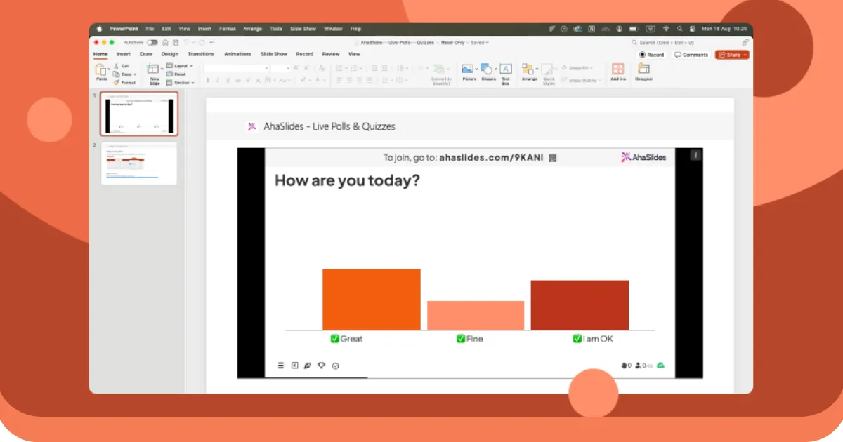
Using AhaSlides for live survey result presentation
AhaSlides is an all-in-one audience engagement platform covering polls, rating scales, word clouds, open-ended questions, and Q&A in a single session. For trainers and facilitators who run sessions live, AhaSlides lets you present survey results in real time during the session itself. Poll results, rating scale responses, and word cloud outputs update as participants respond, so you can share findings with the room while the content is still fresh rather than compiling results into a report that arrives days later.
This is particularly useful for post-training evaluations, where seeing aggregate confidence scores as a group often triggers more honest discussion than reading a debrief report a week after the session. When 60% of the room indicates low confidence on a key skill and that data appears on screen during the closing discussion, it changes what happens next: trainers can address the gap immediately, and participants can see they are not alone in what they found difficult.
AhaSlides also exports responses as spreadsheet data for more detailed analysis after the session ends, so live presentation and post-session reporting work from the same data without extra steps. Think of it less like a debrief report and more like a live scoreboard. People respond differently when they can see the numbers in real time.
Common mistakes to avoid
Presenting every question. Audiences cannot absorb 25 data points in a single meeting. Curate ruthlessly. Move less significant questions to an appendix so the data is available if asked, but keep the main presentation focused on the three to five findings that are genuinely worth the room's attention.
Using the wrong chart type. A pie chart with eight slices tells people nothing. A stacked bar comparing Likert distributions across five questions tells them a lot. Before finalizing any visual, ask whether a colleague unfamiliar with the survey could correctly interpret it in under ten seconds. If not, simplify or switch formats.
Skipping the "so what." Data without interpretation forces the audience to draw their own conclusions, which often means they draw none. Every finding should be followed by one sentence that explains why it matters in practical terms. If you cannot write that sentence, the finding may not belong in the presentation.
Burying the headline. Starting a 20-minute presentation with five minutes of methodology before reaching the main finding is a reliable way to lose the room. Lead with the most important result on slide two or three, then provide context and detail afterward for those who want it.
Presenting to the wrong level of detail. A leadership team needs a different version of the same data than the team that designed the survey. When in doubt, prepare a summary version and keep a more detailed backup ready to pull up if the conversation goes deep.
Frequently asked questions
How long should a survey result presentation be?
For most leadership or stakeholder audiences, 15 to 20 minutes is the target. That is usually enough time to cover three to five key findings, provide supporting context for each, and close with recommendations. If the findings are complex or the audience expects a detailed walkthrough, 30 minutes is a reasonable ceiling. Anything longer should be structured as a workshop or working session, not a presentation.
What should go in the appendix?
Include everything you removed from the main presentation but that a curious stakeholder might ask about: the full question-by-question breakdown, demographic splits, verbatim open-ended responses, and any methodology notes. The appendix makes the main deck shorter without making the underlying data inaccessible.
How do you present results when the findings are unflattering?
Report the data accurately and pair it with context. If engagement scores dropped significantly, say so clearly, include any factors that may have contributed, and come prepared with a proposed response. Audiences generally respond better to honest findings with a clear plan than to softened results that leave the real problem unnamed.
To put these into practice, the AhaSlides free survey creator lets you build, share, and analyze surveys in minutes — live in a session or sent as a standalone link.
Sources
[1] Alchemer. Pie chart or bar graph? Presenting survey results. https://www.alchemer.com/resources/blog/pie-chart-or-bar-graph/
[2] Flourish. 5 ways to effectively visualize survey responses. https://flourish.studio/blog/visualizing-survey-data/
[3] Venngage. How to present survey results effectively. https://venngage.com/blog/survey-results/
[4] Insight7. Top methods for presenting survey data to stakeholders. https://insight7.io/top-methods-for-presenting-survey-data-to-stakeholders/
[5] McKinsey Global Institute. The age of analytics: Competing in a data-driven world. https://www.mckinsey.com/capabilities/quantumblack/our-insights/the-age-of-analytics-competing-in-a-data-driven-world