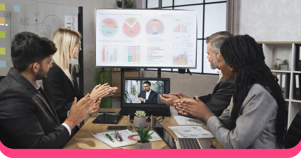



A standard slide deck with bullet points engages a fraction of your audience's cognitive capacity. Add relevant visuals and that number rises significantly, according to cognitive science research. Combine visuals with audio narration and interactive elements, and you're approaching what cognitive scientist Richard Mayer calls optimal multimedia learning - where multiple brain regions process information simultaneously, leading to significantly deeper understanding and retention.
That's the promise of multimedia presentations. Not just "slides with videos," but a strategic combination of text, images, audio, video, animation, and interactive elements designed to communicate more effectively than any single medium alone.
This guide covers what makes multimedia presentations work (and when they backfire), real examples across professional contexts, and a practical framework for creating your own.
What a multimedia presentation actually is
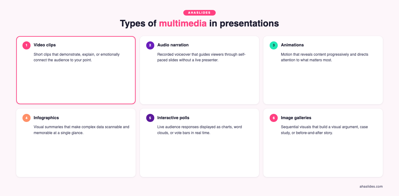
A multimedia presentation combines two or more media formats - text, images, video, audio, animation, or interactive elements - to convey information. The key word is "combines." Simply adding a stock photo to a text-heavy slide isn't multimedia. True multimedia uses each format intentionally, playing to its strengths.
Text explains. Images show. Video demonstrates. Audio sets tone. Animation reveals process. And interactive elements - polls, quizzes, live responses - create participation.
Research from the University of California's Mayer Lab demonstrates what's known as the multimedia principle: people learn better from words and pictures together than from words alone. But Mayer's research also reveals important nuance. When multimedia elements compete for the same cognitive channel (like reading text while narrating the same words), comprehension actually decreases. This is the redundancy effect, and it's the most common mistake in multimedia presentations.
The takeaway: each media element should add something the others don't. If your video says exactly what your text says, one of them shouldn't be there.
Multimedia presentation examples across professional contexts
The best way to understand effective multimedia is to see how it works in practice. Here are examples from different professional settings, with analysis of why each approach works.
Corporate training: onboarding presentation
A financial services company redesigned their compliance onboarding from a 90-slide text-heavy deck into a multimedia experience. The new version used short scenario-based videos (60-90 seconds each) showing common compliance situations, followed by interactive quiz questions where new hires chose how they'd respond. Real policy text appeared only as reference callouts, not as the main content.
Why it works: Video provides context that text can't (tone of voice, facial expressions, environmental cues). The quiz questions create active processing rather than passive reading. Research on the testing effect shows that retrieving information through quizzes improves long-term retention by 50-80% compared to simply reviewing material.
Media mix: Video (scenarios) + interactive quizzes (comprehension checks) + text (policy references) + images (process flowcharts)
Sales presentation: product demo
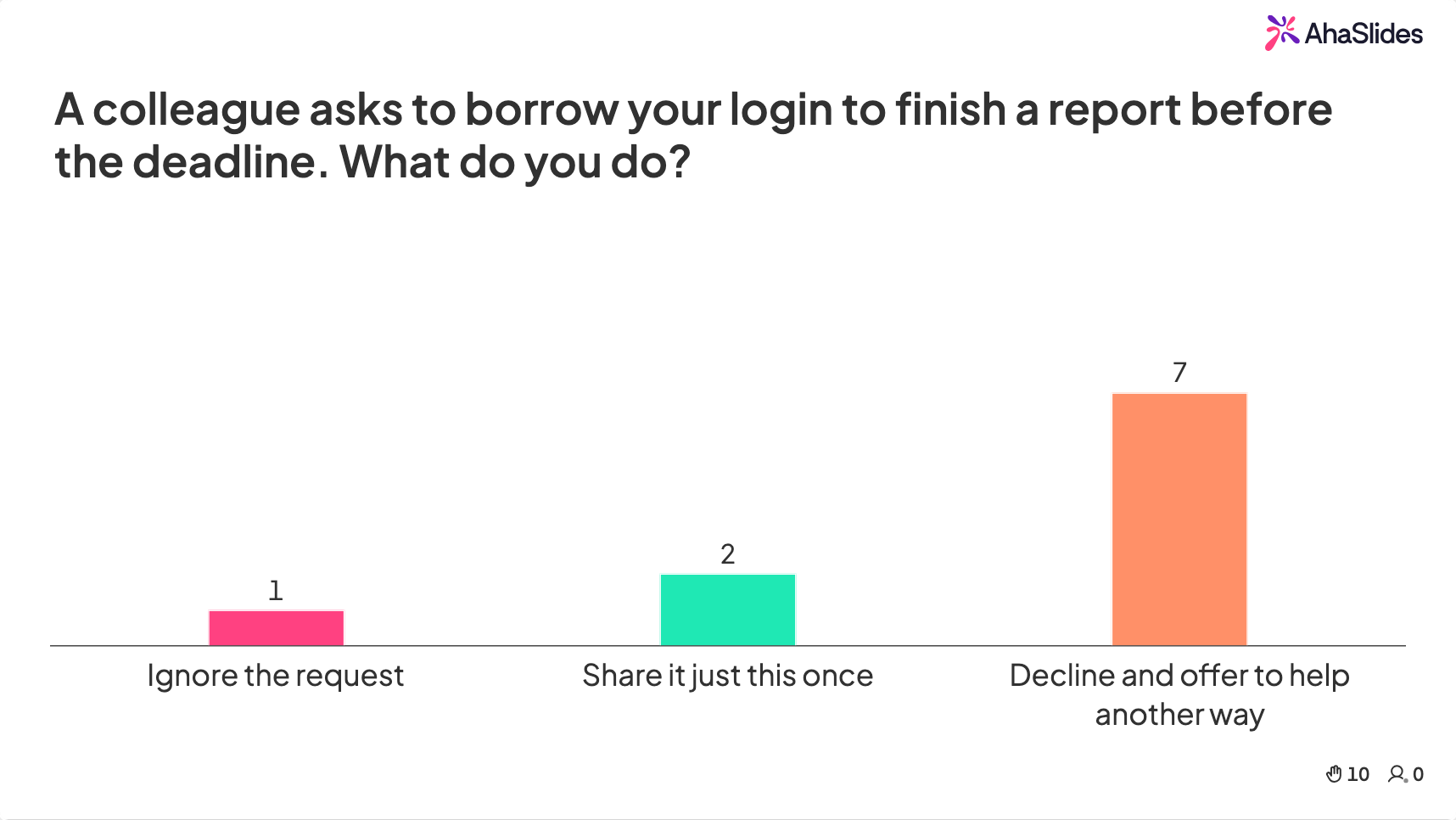
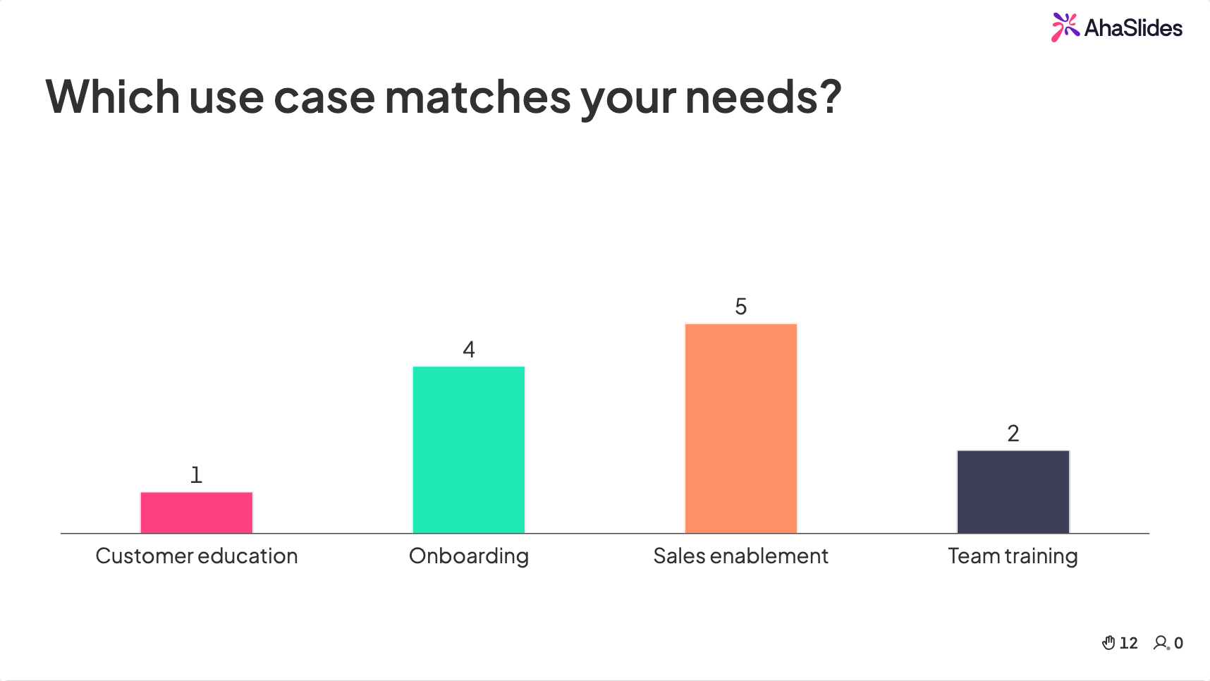
A SaaS company replaced their traditional feature-walkthrough deck with a multimedia approach: opening with a 30-second customer testimonial video, then using live product screenshots annotated with motion graphics to highlight key features, and closing with a live poll asking the prospect which use case most matched their needs.
Why it works: The testimonial video builds social proof through a real voice (more persuasive than text quotes). Annotated screenshots show the actual product rather than describing it. The closing poll creates engagement and gives the sales team immediate insight into what matters most to the prospect.
Media mix: Video (testimonial) + annotated screenshots (product demo) + animation (feature highlights) + live poll (needs identification)
All-hands meeting: quarterly update
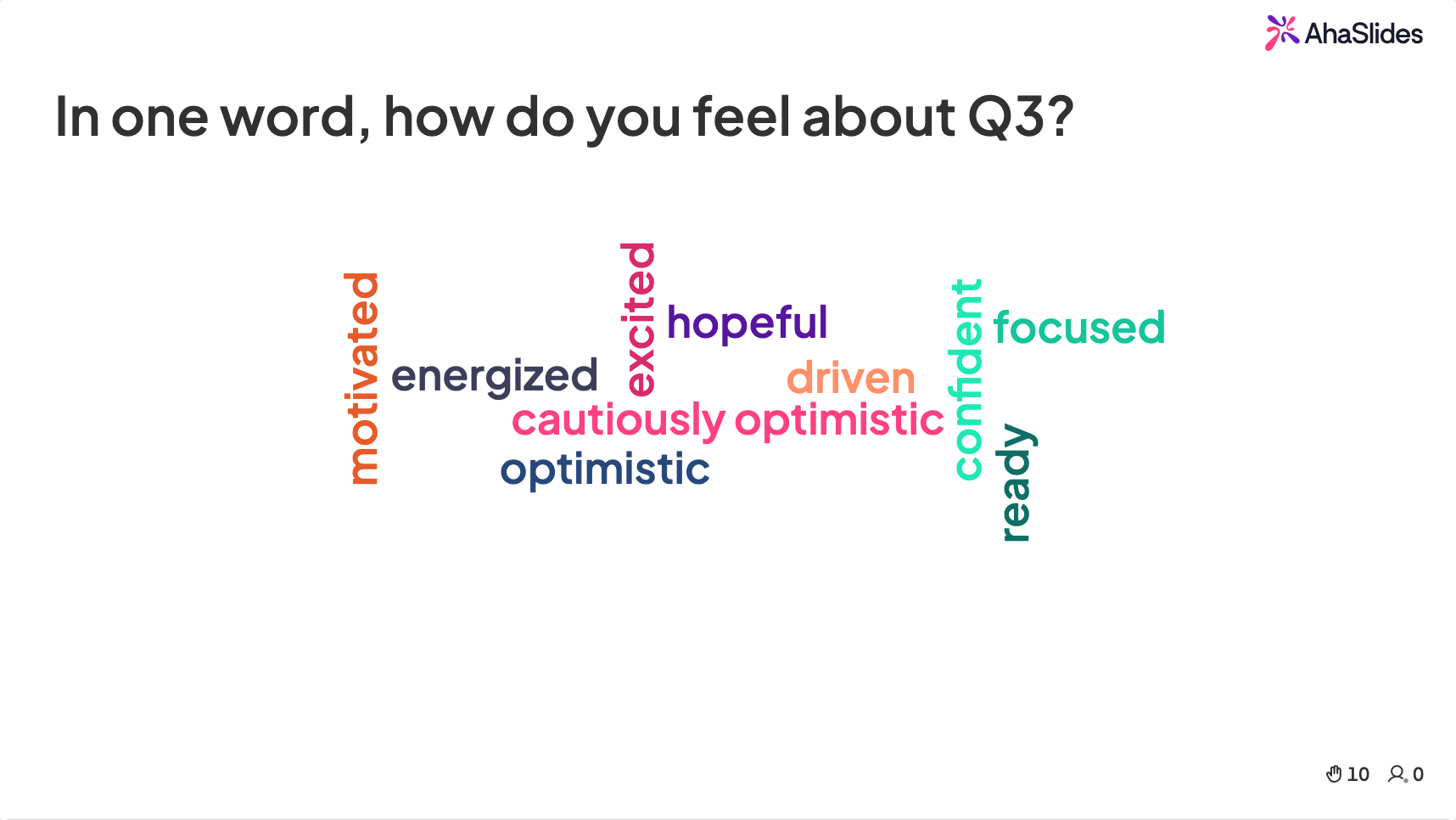
A tech company's leadership team transformed their quarterly business review from a dense data deck into a multimedia presentation that opened with a 60-second animated infographic showing key metrics trending over time, used live word clouds to capture employee sentiment ("In one word, how do you feel about Q3?"), and broke complex strategy slides with short video clips from team leads explaining their priorities.
Why it works: Animation makes data trends visible and intuitive. Word clouds create collective participation and give leadership real-time insight into employee sentiment. Video clips from team leads humanize strategy and distribute the presentation energy across multiple voices.
Media mix: Animation (data visualization) + video (team lead updates) + interactive word clouds (sentiment capture) + text (key decisions and next steps)
Educational lecture: science class
A university professor redesigned a biology lecture by embedding a short time-lapse video of cell division, followed by an interactive labeling exercise where students identified structures on their phones, and a concept-check poll before moving to the next topic.
Why it works: Time-lapse video makes invisible processes visible. The labeling exercise engages spatial reasoning and tests comprehension in real time. The concept-check poll follows the principle of spaced retrieval, which research consistently shows improves learning outcomes.
Media mix: Video (time-lapse) + interactive exercise (labeling) + live poll (comprehension check) + images (diagrams) + text (key terminology)
How to create a multimedia presentation in five steps
Step 1: Define your one core message
Before choosing any media, clarify the single most important thing your audience should take away. Everything in your presentation should support this message. If a multimedia element doesn't serve the core message, it's decoration - and decoration dilutes focus.
Ask yourself: "If my audience remembers only one thing from this presentation, what should it be?"
Step 2: Map your content to the right media types
Not every point needs every media type. Use this framework to match content to format:
Use text when you need precision (exact numbers, specific instructions, quotes you want attributed accurately).
Use images when you need recognition or emotional response (showing a product, illustrating a concept, creating atmosphere).
Use video when you need to demonstrate process, show real-world context, or leverage human connection (testimonials, demonstrations, storytelling).
Use animation when you need to reveal sequence, show change over time, or make abstract concepts concrete (data trends, workflows, system architectures).
Use audio when you need to set mood, provide narration for self-paced content, or add dimension to visual-heavy slides (background music during reflection moments, voiceover for complex diagrams).
Use interactive elements when you need audience participation, comprehension checks, or real-time data (live polls, quizzes, word clouds, Q&A sessions).
Step 3: Design for cognitive load
This is where most multimedia presentations go wrong. Adding too many media types to a single slide overwhelms your audience's processing capacity. Mayer's research identifies several principles to follow.
The coherence principle: remove anything that doesn't directly support learning. That interesting-but-tangential video? Cut it. The animated background? Lose it.
The signaling principle: use visual cues (arrows, highlights, numbered steps) to guide attention to what matters.
The segmenting principle: break complex information into manageable chunks rather than presenting everything at once. This is especially important in longer presentations - build in natural pauses between multimedia-heavy sections.
A practical rule: limit each slide to one or two media types maximum. A slide with text, an image, a video, and an animation is fighting itself for your audience's attention.
Step 4: Build interaction into the flow
Static multimedia (video, images, animation) improves comprehension. Interactive multimedia (polls, quizzes, exercises) improves retention and engagement. The most effective multimedia presentations combine both.
A simple pattern that works well: present information using static multimedia (show a video, display data with animation), then immediately follow with an interactive element that requires your audience to process what they just saw (quiz question, poll, word cloud reflection).
This present-then-interact rhythm keeps audiences engaged because they know participation is coming. It also gives you real-time feedback on whether your content is landing.
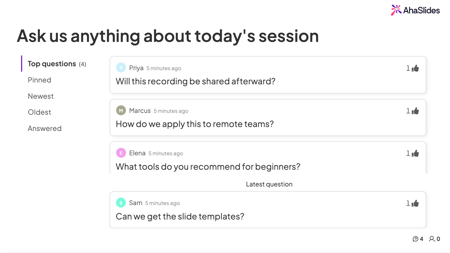
Tools like AhaSlides make the interactive layer simple to execute. You can build live polls, quizzes, word clouds, and open-ended questions directly into your presentation flow - whether you're presenting in PowerPoint, Google Slides, or AhaSlides' own editor. Attendees participate from their phones, and responses appear on screen in real time, creating a shared multimedia experience rather than a one-way broadcast.
Step 5: Test everything before you present
Multimedia presentations have more failure points than simple slide decks. Before presenting, run through a complete technical check.
Verify that videos play correctly (including audio) on the exact device and in the exact room or platform you'll use. Test interactive elements to confirm response times are acceptable. Check that your slides display properly on different screen sizes if attendees will view them remotely. Have a backup plan for each multimedia element - if a video doesn't play, what will you say instead?
Professional presenters also do what's called a "cognitive walkthrough": they present the full deck to one or two colleagues and ask where they felt confused, overwhelmed, or disengaged. This catches problems that technical testing alone misses.
Common multimedia mistakes to avoid
The kitchen sink approach. Using every available media type because you can, not because you should. More media doesn't mean better communication. Each element needs a clear purpose.
Ignoring accessibility. Videos without captions, images without alt text, color combinations that don't work for colorblind viewers, and audio-dependent content with no visual alternative. Roughly 15-20% of any audience has some form of accessibility need. Design for them.
Letting media replace your message. A stunning animation that doesn't communicate anything useful is just eye candy. Every multimedia element should answer the question: "What does this help my audience understand that they wouldn't understand without it?"
Skipping the rehearsal. Multimedia timing is tricky. A video that runs 10 seconds too long throws off your pacing. An animation that loads slowly creates an awkward pause. Rehearse with your actual multimedia elements, not just your notes.
Frequently asked questions
What's the easiest way to start with multimedia presentations? Start by adding one interactive element to your existing slides. A single live poll or quiz question in the middle of a standard presentation is the lowest-effort, highest-impact change you can make. Once you're comfortable, layer in video, animation, and additional interaction points gradually.
Do multimedia presentations work for virtual settings? They work even better virtually, because virtual audiences need more stimulation to stay engaged. The key adjustment is designing for smaller screens (larger fonts, simpler visuals) and ensuring interactive elements work across devices. Tools like AhaSlides are specifically designed for both in-person and virtual delivery.
How many multimedia elements should I use per slide? One or two maximum. Research on cognitive load consistently shows that more media types per slide leads to worse comprehension, not better. Each slide should have a clear primary media element and, at most, one supporting element.
Can I make a multimedia presentation in PowerPoint? Yes, PowerPoint supports video, audio, animation, and images natively. For interactive elements like live polls and quizzes, you'll need an add-on like AhaSlides, which integrates directly with PowerPoint to add real-time audience participation without leaving the platform.
To add live polls, quizzes, word clouds, and Q&A to your next session, AhaSlides handles all of it from a free account, across PowerPoint, Google Slides, or its own editor. For the full guide covering techniques, tools, and ideas for every context, see: How to make a presentation interactive: the complete guide.