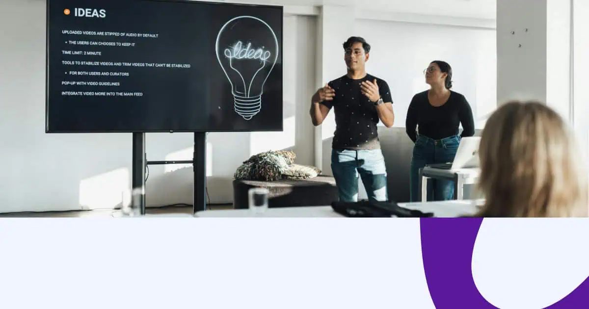
Are you a participant?

Creating Affinity Diagram | Step-By-Step Guide For Beginners in 2024

Creating Affinity Diagram | Step-By-Step Guide For Beginners in 2024

Education

Jane Ng 03 Apr 2024 5 min read

Have you ever been in a situation where you are flooded with data and do not know where to begin or how to use them? Or are you a new employee who is struggling to find a way to organize and scan a large volume of information? Don’t worry! An Affinity Diagram can be a valuable tool to help you simplify messy, unstructured, or unorganized data.

Let’s learn about Affinity Diagram, its benefits, and how to use it effectively!

Table of Contents

Image: evatotuts+

Better Brainstorm Sessions with AhaSlides

10 Golden Brainstorm Techniques

Alternative Text


Need new ways to brainstorm?

Use fun quiz on AhaSlides to generate more ideas at work, in class or during gatherings with friends!


šŸš€ Sign Up For Freeā˜ļø

What Is An Affinity Diagram?

An affinity chart is a visualizing tool that helps you to represent complex information visually and is easy to understand by organizing and grouping a large amount of information or data based on their relationship or similarities. 

To create an affinity diagram, you need to collect all of your data, ideas, or problems, then group them into categories based on common themes or patterns. And the result will be a diagram showing how all the different groups relate to each other.

This diagram will be especially helpful during brainstorming sessions, project planning, or problem-solving meetings when there is too much overlapping information that needs to be resolved. 

Why We Need An Affinity Diagram?

Using affinity diagrams can have several benefits. Here are some key reasons why you might want to use one:

1/ To organize large amounts of information

Massive information can be sorted out clearly by an affinity diagram.

By grouping related items, you can easily identify patterns and relationships between different pieces of information, thereby making them more manageable and easier to understand.

2/ To better clarify information

While creating an affinity diagram, you can better understand existing information. This can be especially helpful when working with complex data or when trying to understand many different ideas. At the same time, it is very effective in identifying fundamental problems or opportunities for improvement.

Image: freepik

3/ To encourage collaboration

Affinity diagrams are often created in team settings, which can encourage collaboration and teamwork. By working together to organize information, team members can achieve a shared understanding of the data and develop a sense of ownership over the process.

4/ To improve creativity

Affinity diagrams are often applied in brainstorming sessions, where they can help spark creativity and generate new ideas. By grouping related ideas, you can come up with new approaches and connections between ideas you might not otherwise notice.

5/ To improve decision-making

An affinity diagram also can help clarify current issues and provide a framework for decision-making. It can be especially useful during problem-solving meetings or when working on complex projects.

How To Create An Affinity Diagram?

Here is a step-by-step guide on how to create an affinity diagram:

What does it look like?

Step 1 – Identify the problem or topic

Before you begin, you need to define the problem or topic you want to address. This will help you stay focused and ensure that your affinity diagrams are relevant and useful.

Step 2 – Collect data

Once you’ve identified the problem or topic, start gathering data or ideas. This can be done through surveys, interviews, or other methods.

Step 3 – Write down ideas

When you collect data, write down each idea or data point on a separate notepad or index card. Remember to keep each idea or data point on a separate card to easily move later.

Step 4 – Group similar ideas

After you have enough sticky notes or index cards, start grouping similar ideas. Look for common themes or patterns and group the cards accordingly.

Step 5 – Label groups

After you’ve grouped the tags, label each group with a descriptive title. It will help you remember what each group means, and organize information more quickly.

Step 6 – Arrange the groups

Next, organize the groups in a logical order, with related groups placed close together, which helps to show the relationships between the different groups.

Step 7 – Identify patterns and relationships

After the groups are sorted out, you can look for patterns and relationships between the different groups. These relationships can help you identify underlying problems or opportunities for improvement.

Step 8 – Draw the final diagram

Finally, draw a final affinity diagram, using lines or arrows to represent the relationships between the different groups. These lines will help provide a visual representation of the data and make it easier to understand.

Step 9 – Review and refine

Once you’ve created the affinity diagram, review it carefully and refine it as needed. This could involve adding or removing groups, adjusting the way the groups are organized, or making other changes to improve the clarity and usefulness of the diagram.

Photo: freepik

Tips For Using An Affinity Diagram Effectively

When using an affinity diagram, these few tips below will ensure that the process is effective and that the results are useful. 

  • Get everyone involved: The success of an affinity diagram depends on the participation of everyone in the group. By involving everyone such as team members, subject matter experts, or customers, you can ensure that you gather a wide variety of perspectives and ideas. This can lead to a more comprehensive and accurate understanding of the current issue or topic.
  • Be flexible: An affinity diagram is a flexible tool that can be refined and changed as needed. Don’t be afraid to move items around or adjust groups to create the most logical and useful categories. The flexibility will ensure that the final diagram is accurate and useful.
  • Use clear headings: The headings of each group should be clear and descriptive so that you can easily remember what each group means. They will make the diagram easy to read and understand for everyone.
  • Use color coding and visuals: Color coding and visuals can help to make the diagram more seemingly appealing and easier to understand. For example, you might use different colors to represent different categories or icons or images to represent key concepts.
  • Keep it simple: Diagrams should be easy to understand at a glance. Avoid complicating it with too many categories or notes. Focus on the most important themes and patterns and keep the diagram as simple and straightforward as possible.
Photo: freepik

Key Takeaways

Hopefully, with the guide above, you can create an affinity diagram that can help you and your team generate unique ideas and develop effective solutions.

And if you’re looking for an easy-to-use platform to make brainstorming sessions, meetings, training sessions, and workshops more engaging than ever, you might want to check out AhaSlides! Take a tour around our template library right now!