

You've seen the slide. Maybe you've made the slide. Forty words across eight bullet points, all of them necessary, none of them readable from the third row. The presenter reads each one aloud while the audience reads ahead, finishes before them, and spends the next thirty seconds waiting for the next slide.
That's not a presentation. That's a document with someone standing next to it.
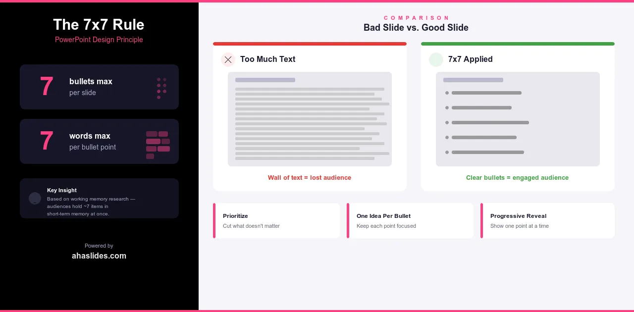
The 7x7 rule exists to prevent exactly this. The idea is simple: no more than 7 bullet points per slide, no more than 7 words per bullet. Two constraints. One principle. And if you apply it consistently, your slides stop competing with your voice and start supporting it.
What the 7x7 rule is
The rule has two parts:
No more than 7 bullet points per slide. No more than 7 words per bullet point.
The rule comes from research on working memory. Our brains can hold roughly seven items in short-term memory at once. Go beyond that and information starts getting dropped, not because your audience isn't paying attention, but because you've exceeded what human cognition can comfortably handle at one time.
Seven bullets, seven words each. That's the threshold where slides and speech start working together instead of against each other.
Why the 7x7 rule works
When you enforce the rule, you're forced to decide what actually matters. You can't fit everything into seven bullets of seven words. Something has to go. That constraint is the point. Every time you cut a bullet, you're making a judgment call about what your audience actually needs to know versus what you just felt safer including. The rule makes your presentation stronger by making you edit.
It also respects how attention actually works. Reading and listening are both language-processing tasks. Ask your audience to do both at once and they'll pick one, usually reading, and tune out your voice while they work through the slide. Keep your bullets short enough to absorb in a glance and you give people a reason to look up and listen. The slide becomes a prompt, not a script.
There's a related benefit that's easy to overlook: when your slides are lean, you get room to speak. Every piece of context, every story, every example that doesn't fit in seven words can come out of your mouth instead. That's not a limitation. That's the whole point of having a presenter in the room. If everything worth knowing is already on the slide, nobody needs you there.
Interpreting the rule
The 7x7 rule is a guideline, not a law. Knowing when to follow it strictly and when to bend it is part of using it well.
For most presentations, treat it as a hard limit. Business meetings, sales pitches, training sessions, conference talks: these are contexts where your audience expects clean slides and will notice when they're not. Violating 7x7 in these settings doesn't just make your slides harder to read. It signals that you haven't edited your thinking.
For technical presentations to specialist audiences, the calculus shifts slightly. Engineers reviewing specifications, researchers walking through methodology, analysts presenting detailed models: these audiences sometimes need more on screen to follow the argument. Even then, 7x7 should be your default. Exceed it only when the content genuinely requires it, not because trimming felt like too much work.
A few things worth clarifying about what the rule actually covers:
A bullet that wraps to a second line has already broken the rule. Seven words means seven words on one line. If you're editing and a bullet keeps running long, that's usually a sign the point needs to be split or cut rather than squeezed.
The rule applies regardless of format. Numbered lists, arrows, icons with labels: if you're presenting a list of items, the same limits apply. The principle is about cognitive load, not bullet point characters.
Common 7x7 mistakes
The most common one is treating the rule as a starting point rather than a limit. People write detailed bullets first, then try to trim them down. By that point, the slide is built around too much information and cutting feels like loss. The fix is simple: write short from the start. Seven words is your ceiling, not your target.
The second mistake is gaming the rule with punctuation. Splitting one long bullet into two shorter ones that only make sense together doesn't count. If two bullets can't stand alone, they're one bullet that needs editing, not two bullets that need a semicolon between them.
The third is applying the rule to bullets but ignoring titles. A slide title that runs to twelve words undermines the same principle you're trying to enforce everywhere else. Titles should be short enough to scan in a glance, just like everything else on the slide.
The last one is subtler. Some presenters follow 7x7 faithfully on every individual slide but stack ten text-heavy slides back to back without a break. Seven bullets seven times in a row is still cognitive overload. The rule works best when it's part of a broader rhythm: text slides, then a visual, then an interactive moment, then text again. Give people room to breathe between the dense parts.

Progressive reveal: an alternative approach
Progressive reveal is what it sounds like: instead of showing all your bullets at once, you reveal them one at a time on click as you talk through each point. At any given moment, your audience sees only what you're currently discussing.
It's a useful technique, but it's worth understanding what it actually solves and what it doesn't.
What it solves is attention management. When everything is already on screen, people read ahead, finish before you, and spend the next thirty seconds waiting. Progressive reveal prevents that. Each click is a small reset, pulling focus back to the current point before moving to the next.
What it doesn't solve is having too much content. If you have fifteen bullets that all need to be on one slide, revealing them one at a time doesn't fix the underlying problem. It just slows down the experience of encountering too much information. The 7x7 rule and progressive reveal aren't interchangeable. One is about how much you put on a slide. The other is about how you sequence it.
Progressive reveal works best for sequential arguments where each point builds on the last, step-by-step processes where seeing everything at once would create confusion, and detail-heavy sections where you want to control the pace carefully.
One hard limit: progressive reveal doesn't work for slide decks people will read without you. If someone opens your presentation later, they won't know hidden bullets exist. They'll assume the slide is incomplete. For any deck that needs to stand alone, 7x7 is the only viable approach.
Most presenters end up combining both. 7x7 for the majority of slides, progressive reveal for a handful of sections where the sequencing genuinely matters.
Putting 7x7 into practice
When you sit down to build your next presentation, start with a simple constraint: nothing on screen that doesn't need to be there.
That means writing your bullets last, not first. Draft your talking points in your speaker notes. Figure out what you're actually going to say. Then ask what the slide needs to show to support that, not summarize it, not repeat it, just support it. What comes out is usually much closer to 7x7 than anything you'd produce by starting with the slide.
It also means editing ruthlessly. If a bullet runs long, cut it. If two bullets only make sense together, merge them. If a slide has nine points and they all feel essential, that's a sign the slide is trying to cover too much ground. Split it, or find a different format entirely.
One useful test: cover your speaker notes and look at the slide alone. If someone could read it and skip your presentation entirely, it's doing too much. If it raises more questions than it answers, you're in the right territory.
Taking it further with AhaSlides
The 7x7 rule is fundamentally about reducing cognitive load. Interactive elements do the same thing from a different angle: instead of simplifying what's on screen, they give your audience something to do, which shifts them from passive receivers of information to active participants in it.
Where you'd otherwise cram findings into twelve bullet points, a live poll lets your audience engage with the same question before you reveal the answer. Where a dense summary slide would lose people, a word cloud or quiz creates a moment of participation that consolidates the same information more effectively.
The two approaches work well together. 7x7 keeps your slides lean. AhaSlides keeps your audience present. Neither replaces good content, but both make it land better.
Wrapping up
The number seven isn't sacred. Five bullets of five words each is better than seven of seven. The principle behind the rule matters more than the rule itself: keep slides simple enough that your voice is the main event, not a commentary track running alongside a wall of text.
Apply that principle consistently and something shifts. Your slides get cleaner. Your delivery gets more confident. Your audience stops reading and starts listening.
That's the whole point.