

Think about the last presentation that genuinely held your attention from start to finish. Chances are it was shorter than most, had fewer slides than you expected, and the text on screen was big enough to read without squinting. That combination isn't accidental. It's the result of deliberate constraint.
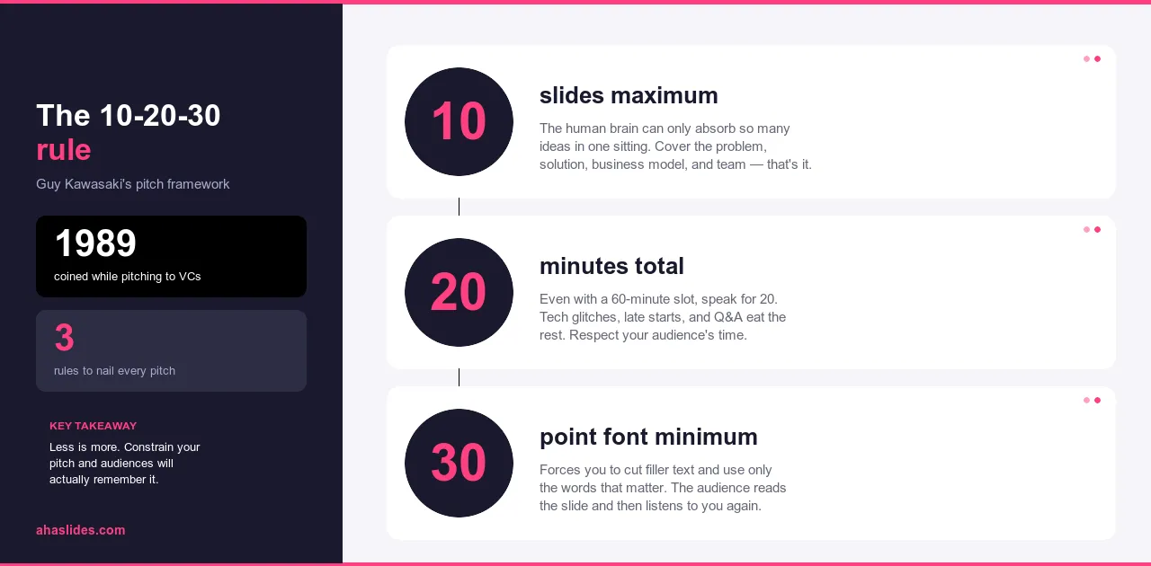
The 10-20-30 rule was developed for investor pitch presentations by Guy Kawasaki, where the stakes of losing your audience are immediate and visible. The logic proved so transferable that it became one of the most widely applied frameworks in professional presenting. Ten slides. Twenty minutes. Thirty-point font minimum. Three numbers that solve most of the problems that make presentations forgettable.
This guide explains why each constraint works, how they interact, and how to apply the framework to any presentation you're building, whether you're pitching investors, training employees, or making the case for something to a room of skeptical decision-makers.
The problem this rule was built to solve
Most people have sat through a presentation that felt like punishment. Slides in the sixties. Dense paragraphs in eight-point font. The speaker reading verbatim from the screen while the audience reads faster, finishes before them, and spends the remaining time waiting for the next slide. Nothing lands. Nothing sticks. Everyone leaves having absorbed less than they would have from a well-written email.
This isn't a rare failure mode. It's the default. Most presentation software makes it easy to add slides and easy to add text, which means most presentations end up with too many of both. The medium drifts toward comprehensiveness because comprehensiveness feels safe. Cutting feels like losing something. It isn't. It's editing, and editing is what makes a presentation work.
The 10-20-30 rule is a correction for this drift. Not a creative constraint imposed from outside, but a set of limits that push every decision in the same direction: toward a presentation where the speaker carries the argument and the slides support it, rather than the other way around.
What is the 10-20-30 rule?
The rule has three parts, each addressing a different way that presentations typically go wrong.
Ten slides maximum. Not ten slides as a target but ten slides as a ceiling. The constraint forces a kind of editorial discipline most presentations never develop: you have to decide what's essential rather than including everything that might be relevant. When you can't fit it all, you're forced to prioritize. What's left after that process is almost always stronger than what you started with.
Twenty minutes maximum. This is roughly the window where audiences can maintain sustained focus without a break. Beyond twenty minutes, attention doesn't gradually decline, it falls off more steeply. A twenty-minute presentation also fits more easily into schedules and signals respect for your audience's time in a way that a sixty-minute session simply doesn't.
Thirty-point font minimum. Small text is a symptom, not a design choice. Presenters use it to fit more content onto slides, which means more content gets read aloud, which means the audience watches someone read rather than listening to someone speak. A thirty-point minimum prevents the slide from becoming the presentation. You can't fit paragraphs at that size. You're forced to put the detail where it belongs: in your voice.
The three constraints reinforce each other. Fewer slides mean less content. Less content means shorter presentations. Larger font means less text per slide. Together they push in the same direction: toward a presentation where the speaker is the main event and the slides are supporting material.
Why 10 slides
Most presentations have too many slides because the presenter hasn't made the hard decisions about what actually matters. Adding a slide feels like adding value. It rarely is. It's usually deferring the choice between two ideas that should have been one.
Ten slides forces that choice. When you hit the limit and still have content left over, you have to decide: is this idea important enough to replace something already there, or does it belong in a handout, a follow-up email, or a verbal explanation? That decision is the work. The constraint is what makes you do it.
The result is a presentation built around your strongest material rather than your complete material. Every slide earns its place. Nothing is there because you ran out of reasons to cut it.
A structure that works across most presentation types follows this logic: open with the problem, establish why it matters, introduce your solution, explain how it works, provide proof, show who it's for, address the competitive or alternative landscape, establish the capability to execute, lay out the resources required, and close with a specific ask. Ten slides. One idea each. A complete argument from problem to action.
The proportions shift depending on context. A training presentation replaces the competitive landscape with an implementation plan. A sales presentation replaces the team slide with customer evidence. The underlying logic stays the same: problem, solution, proof, ask.
Why 20 minutes
Most people lose sustained focus after roughly twenty minutes of continuous listening. This isn't a personal failing or a modern attention span problem. It's a consistent pattern across how human attention works. Beyond that window, you're not just asking for more time. You're asking for something people can no longer easily give.
Twenty minutes is also a practical number. It fits into a thirty-minute meeting slot with room for questions. It's easier to schedule than an hour. People are more likely to attend, more likely to stay present throughout, and more likely to leave with a clear memory of what was said.
The time breaks naturally into three sections. The opening, where you earn attention and establish why this matters to this specific audience, takes two to three minutes. The core content across three to four main points takes twelve to fourteen minutes, roughly three to four minutes per point. The conclusion and call to action takes two to three minutes. That leaves a minute or two of buffer, which presentations almost always need since they run long more often than short.
If your material genuinely requires more time, the right response isn't to extend the presentation. It's to move the detail into supporting documents and use the twenty minutes for the argument that makes people want to read them.

Why 30-point font
Small font is what happens when the slide is trying to do too much. The presenter wants to include a full explanation on screen, so the font shrinks to fit. Then, because the explanation is on screen, they read it aloud. The audience reads faster than the presenter speaks, finishes the slide before the presenter does, and spends the remaining time waiting rather than listening.
Thirty-point minimum breaks that pattern. At that size, a standard slide holds three to four short lines of text. A headline and two supporting phrases. A single statistic with a label. That's it. The detail that used to live on the slide has to go somewhere else, and the only place it can go is into spoken delivery where it belongs.
The constraint also solves an accessibility problem that presenters rarely think about. People in the back of the room can read thirty-point text. People with vision challenges can read thirty-point text. Small text excludes parts of your audience silently and without any signal that it's happening.
Some presenters apply even stricter limits than this, reducing slides to a single image or a handful of words. The principle behind those approaches is the same as the 10-20-30 rule: the less the slide says, the more the presenter has to. And a presenter speaking from genuine understanding is almost always more engaging than slides being read aloud.

What it looks like in practice
The difference between a presentation built with this framework and one without it is easier to see in a specific example than to describe in the abstract.
Imagine you're presenting a new employee training program to your leadership team. Without any constraint on length or structure, you prepare 35 slides: program history, market research, competitor analysis, detailed curriculum breakdown, cost breakdowns by department, implementation timelines for each location, appendices. The presentation runs 75 minutes. Executives lose focus somewhere around slide 20. You finish, thank everyone, and wait weeks for a response that may never come. The information was all there. The argument wasn't.
With the 10-20-30 framework, the same proposal becomes ten slides:
- The problem: current onboarding takes three months and produces inconsistent results across locations.
- The cost: delayed productivity, high early attrition, inconsistent customer experience.
- The solution: a structured eight-week program with standardized content and manager checkpoints.
- How it works: three phases covering orientation, role-specific training, and supervised practice with feedback loops.
- Pilot results: the program ran at two locations over six months, with measurable improvements in retention and time-to-productivity.
- Implementation plan: rollout across all locations over twelve months with a dedicated project lead.
- Resources required: budget, headcount, and technology needs broken down by phase.
- Timeline: key milestones from approval through full deployment.
- Risk and mitigation: the three most likely obstacles and how the plan addresses each.
- The ask: approval for a twelve-month pilot budget and a project lead appointment.
You present in eighteen minutes. The argument is clear: this program works, the plan is realistic, and the budget is justified. Executives understand what they're being asked to approve. You follow up with the full documentation, but the live presentation did its job.
The 35-slide version and the 10-slide version contain much of the same information. The difference is that one makes an argument and one presents a file.
How to build a 10-20-30 presentation
Start before you open a slide deck. Write your core message as a single sentence: what is the one thing you want your audience to remember or do? If you can't write that sentence, you don't have a clear enough argument yet. That's useful to know before you've built thirty slides around it.
Then list everything you think belongs in the presentation. Don't edit at this stage. Get it all out, then look at what you have. What's essential? What's supporting? What's padding that you included because it felt safer than leaving it out?
Organize what remains into a narrative: problem, solution, evidence, ask. Assign one idea to each of your ten slides. If you have more than ten ideas that feel essential, you're either covering too broad a topic or you haven't made the hard choices yet. Make them now rather than in front of your audience.
For each slide, ask whether you can show the idea rather than describe it. A chart that makes the point visually does more work than text that explains it verbally. Move anything that doesn't fit at thirty-point font into your spoken delivery, where it belongs.
Practice out loud and time yourself. Know where you're running long and cut there rather than speeding up. A presentation that fits twenty minutes at normal pace is a different thing from one that fits twenty minutes when rushed. The former respects your audience. The latter signals that you didn't edit enough.

Common concerns
The most frequent objection is that twenty minutes isn't enough for complex topics. It usually is. The mistake is confusing comprehensive coverage with effective communication. A twenty-minute presentation that makes three clear points and earns the audience's trust does more than a sixty-minute presentation that covers everything and is remembered for none of it. The detail belongs in supporting documents that people read when they're ready to go deeper, not in a live session where attention is finite.
The second objection is whether ten is really the right number or whether eleven or twelve would be fine. The number is the point. It's a boundary, not a suggestion. The moment you allow exceptions, you're back on the path toward bloated presentations justified one slide at a time. The discipline of holding to ten is often where the best editorial decisions get made. That slide you're reluctant to cut usually contains something worth saying verbally rather than showing on screen.
Data-heavy presentations raise a legitimate concern: what happens to the numbers that don't fit? The answer is that the numbers that matter go on the slides, annotated clearly. The supporting data goes in a handout or appendix that you reference but don't present. Your job in the room is to make the key findings clear and convincing. The audience can interrogate the full dataset afterward.
The font objection answers itself. Thirty-point minimum means larger text, which means people at the back of the room can read your slides. If your current font size requires the audience to squint or lean forward, that's not a design preference. That's a problem the rule fixes.
Taking it further with AhaSlides
The 10-20-30 rule addresses what goes on your slides and how long you speak. It doesn't address what your audience does while you're presenting, which for most presentations is nothing.
Interactive elements change that. A poll placed at the moment your audience needs to connect the problem to their own situation makes the problem feel personal before you've made your case. A word cloud mid-presentation shows you which ideas are landing and which aren't, in real time, before you've committed to the rest of your argument. An anonymous Q&A built into a natural transition catches the objections your audience has but won't raise out loud.
These moments don't add length or complexity. Built into a 10-20-30 presentation, they fit inside the twenty-minute window and replace passive slide-viewing with active participation. AhaSlides is built to make this straightforward: polls, quizzes, word clouds, and Q&A sessions sit inside your presentation flow so the shift from content to interaction feels deliberate rather than disruptive.
The 10-20-30 rule makes your presentation lean and focused. Interactive elements make it two-directional. Both are worth having.
Wrapping up
The 10-20-30 rule works because the problems it solves are real and consistent. Too many slides. Too much text. Too little time spent on the argument itself. The three constraints address all three at once, and they do it by forcing the decisions that most presenters defer until they're standing in front of a room with no good options left.
Ten slides. Twenty minutes. Thirty-point font. Apply all three to your next presentation and notice what the constraints make you do. The cuts you make are almost always the right ones. The time you save is almost always appreciated. And the presentation that comes out the other side is almost always stronger than the one you started with.