We don't know you, but we guarantee you have experienced a PowerPoint presentation that's gone on far too long. You're 25 slides deep, 15 minutes in and have had your open-minded attitude comprehensively battered by walls upon walls of text.
Well, if you're veteran marketing specialist Guy Kawasaki, you make sure this never happens again.
You invent the 10 20 30 rule. It's the holy grail for PowerPoint presenters and a guiding light to more engaging, more converting presentations.
At AhaSlides, we love great presentations. We're here to give you everything you need to know about the 10 20 30 rule and how to implement it in your seminars, webinars and meetings.
Overview
| Who invented 10-20-30 rule for slideshows? | Guy Kawasaki |
| What is the 1 6 6 rule in PowerPoint? | 1 main idea, 6 bullet points and 6 words per point |
| What is the 20 minute rule for public speaking? | Max time people can listen to. |
| Who invented presentations? | VCN ExecuVision |
Table of Contents
- Overview
- What is the 10 20 30 Rule?
- 3 Reasons to Use 10 20 30
- More Great Tips for Presentations
- More Tips with AhaSlides
- Frequently Asked Questions
More Tips with AhaSlides

Start in seconds.
Get free templates for your next interactive presentation. Sign up for free and take what you want from the template library!
🚀 Grab Free Account
What is the 10 20 30 Rule?
But, the 10-20-30 rule of PowerPoint is a collection of 3 golden principles to abide by in your presentations.
It's the rule that your presentation should...
- Contain a maximum of 10 slides
- Be a maximum length of 20 minutes
- Have a minimum font size of 30
The whole reason Guy Kawasaki came up with the rule was to make presentations more engaging.
The 10 20 30 rule may seem overly restricting at first glance, but as is necessary in today's attention crisis, it's a principle that helps you make maximum impact with minimal content.
Let's dive in...
The 10 Slides

Many people are confused with questions like "How many slides for 20 minutes?" or "How many slides for a 40-minute presentation?". Guy Kawasaki says ten slides 'is what the mind can handle'. Your presentation should get a maximum of 10 points across 10 slides.
The natural tendency when presenting is to try and unload as much information as possible on the audience. Audiences don't just absorb information like a collective sponge; they need time and space to process what's being presented.
For the pitchers out there looking to make the perfect pitch presentation, Guy Kawasaki already has your 10 slides for you:
- Title
- Problem/Opportunity
- Value Proposition
- Underlying Magic
- Business Model
- Go-to-Market Plan
- Competitive Analysis
- Management Team
- Financial Projections and Key Metrics
- Current Status, Accomplishments to Date, Timeline, and Use of Funds.
But remember, the 10-20-30 rule doesn't just apply to business. If you're a university lecturer, making a speech at a wedding or trying to enlist your friends in a pyramid scheme, there's always a way to limit the number of slides you're using.
Keeping your slides to a compact ten may be the most challenging part of the 10 20 30 rule, but it's also the most crucial.
Sure, you've got a lot to say, but doesn't everyone pitch an idea, lecturing at university or signing their friends up to Herbalife? Whittle it down to 10 or fewer slides, and the next part of the 10 20 30 rule will follow.
The 20 Minutes
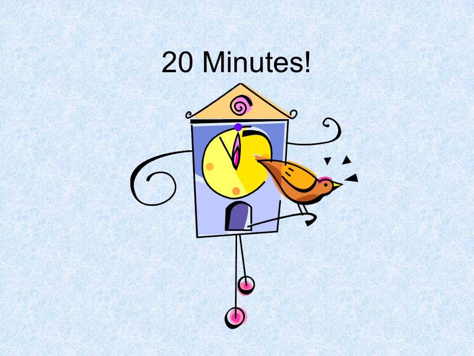
If you've ever been turned off an episode of a Netflix Original because it's an hour and a half long, think about those poor audiences around the world who are, right now, sitting in hour-long presentations.
The middle section of the 10 20 30 rule says that a presentation should never be longer than an episode of the Simpsons.
That's a given, considering that if most people can't even entirely focus through Season 3's excellent Homer at the Bat, how will they manage a 40-minute presentation about projected lanyard sales in the next quarter?
The Perfect 20-Minute Presentation
- Intro (1 minute) - Don't get caught up in the panache and showmanship of the opening. Your audience already knows why they're there, and drawing out the intro gives them the impression that this presentation will be extended. A lengthy introduction dissolves the focus before the production even begins.
- Pose a question / Illuminate the problem (4 minutes) - Get straight into what this presentation is trying to solve. Bring up the main topic of the production and emphasise its importance through data and/or real-world examples. Gather audience opinions to foster focus and illustrate the prominence of the problem.
- Main body (13 minutes) - Naturally, this is the entire reason for the presentation. Offer information that attempts to answer or resolve your question or problem. Provide visual facts and figures that support what you're saying and transition between slides to form the cohesive body of your argument.
- Conclusion (2 minutes) - Provide a summary of the problem and the points you've made that resolve it. This consolidates the audience members' information before they ask you about it in the Q&A.
As Guy Kawasaki states, a 20-minute presentation leaves 40 minutes for questions. This is an excellent ratio to aim for as it encourages audience participation.
AhaSlides' Q&A feature is the perfect tool for those after-pres questions. Whether you're presenting in-person or online, an interactive Q&A slide gives power to the audience and lets you address their real concerns.
💡 20 minutes still sounding too long? Why not try a 5-minute presentation?
The 30 Point Font
One of the biggest audience grievances about PowerPoint presentations is the presenter's tendency to read their slides aloud.
There are two reasons why this flies in the face of everything the 10-20-30 rule represents.
The first is that the audience reads faster than the presenter speaks, which causes impatience and loss of focus. The second is that it suggests that the slide includes way too much text information.
So, which is true about font use in presentation slides?
This is where the final segment of the 10 20 30 rule comes in. Mr Kawasaki accepts absolutely nothing less than a 30pt. a font when it comes to text on your PowerPoints, and he's got two reasons why...
- Limiting the amount of text per slide - Capping each fall with a certain number of words means you won't be tempted to read the information aloud simply. Your audience will remember 80% of what they see and only 20% of what they read, so keep text to a minimum.
- Breaking down the points - Less text means shorter sentences that are easier to digest. The final part of the 10 20 30 rule cuts out the waffle and gets straight to the point.
Suppose you're thinking of a 30pt. the font isn't radical enough for you, check out what marketing guru Seth Godin suggests:
No more than six words on a slide. EVER. There is no presentation so complex that this rule needs to be broken.
Seth Godin
It's up to you whether you want to include 6 or more words on a slide, but regardless, the message of Godin and Kawasaki is loud and clear: less text, more presenting.
3 Reasons to Use the 10 20 30 Rule
Don't just take our word for it. Here's Guy Kawasaki himself recapping the 10 20 30 rule and explaining why he came up with it.
So, we've discussed how you can benefit from the individual sections of the 10 20 30 rule. From Kawasaki's presentation, let's talk about how Kawasaki's principle can raise the level of your presentations.
- More engaging - Naturally, shorter presentations with less text encourage more speaking and visuals. It's easy to hide behind the text, but the most exciting presentations out there are manifested in what the speaker says, not what they show.
- More direct - Following the 10 20 30 rule promotes the necessary information and slashes the redundant. When you force yourself to make it as brief as possible, you naturally prioritise the key points and keep your audience focused on what you want.
- More memorable - Pooling the focus and giving an attractive, visual-centred presentation results in something more special. Your audience will leave your presentation with the correct information and a more positive attitude towards it.
You may be one of the millions of presenters migrating to online presentations. If so, the 10 20 30 rule can be one of many tips to make your webinars more captivating.
More Great Tips for Presentations
Remember that experience we talked about in the intro? The one that makes you want to melt into the floor to avoid the pain of another one-way, hour-long presentation?
Well, it has a name: Death by PowerPoint. We have a whole article on Death by PowerPoint and how you can avoid committing this sin in your presentations.
Trying out the 10-20-30 rule is a great place to start, but here are some other ways to spice up your presentation.
Tip #1 - Make it Visual
That '6 words per slide' rule that Seth Godin talks about may seem a little restricting, but its point is to make your slides more visual.
More visuals help to illustrate your concepts and heighten your audience's memory of the critical points. You can expect them to walk away with 65% of your info remembered if you use images, videos, props and charts.
Compare that to the 10% memory rate of text-only slides, and you've got a compelling case to go visual!
Tip #2 - Make it Black
Another pro tip from Guy Kawasaki, here. A black background and white text is a far more potent than a white background and black text.
Black backgrounds scream professionalism and gravitas. Not only that, but light text (preferably a bit greyer rather than pure white) is easier to read and scan.
White heading text against a coloured background also stands out more. Be sure to leverage your use of black and coloured backgrounds to impress rather than overwhelm.
Tip #3 - Make it Interactive

You might hate audience participation at the theatre, but the same rules don't apply to presentations.
No matter what your subject is, you should always find a way to make it interactive. Getting your audience involved is fantastic for increasing focus, using more visuals and creating a dialogue about your topic that helps the audience feel valued and heard.
In today's online meetings and remote work age, a free tool like AhaSlides is essential for creating this dialogue. You can use interactive polls, Q&A slides, word clouds and much more to gather and illustrate your data, and then even use a quiz to consolidate it.
Want to try this out for free? Click the button below to join thousands of happy users on AhaSlides!
Feature image courtesy of Life Hack.
Frequently Asked Questions
What is 10/20/30 presentation rule?
It means that there should only be ten slides per presentation, no more than twenty minutes, and contain no font smaller than 30 points.
How is 10 20 30 rule effective?
Normal people cannot understand more than ten slides within a business meeting.
What is 50-30-20 rule?
Don't be mistaken, they are not for presentation, as this rule recommend putting 50% of monthly pay toward needs, 30% wants, and 20% savings